Using Custom Parameters
Custom parameters can be used with most components and allow the passing of data into the Liquid scope of a component.
One, or more, custom parameters can be added to a component tag to pass and consume data in different ways. For example, a custom parameter could be used in a CSS class to affect the styling of a component inserted in one location, while leaving other instances unaffected, or customised in a different way.
Another use case could be to control the logic of a component to show or hide specific parts of the layout.
Why Use Custom Parameters
When you’re inserting a component/module in multiple places, it may need to be different in those different places. One option would be to have different components or different layouts. But it is possible to pass a custom parameter into a component insertion and use that to effect the logic or styling of the component.
Here are some use cases I can think of:
- An SVG in a snippet and change the background colour based on a a custom variable. Maybe you need that SVG to be black when you insert it on a red background and white when you insert it on a black background. A logo would be a good example of when this might come into play.
- You may have a module you want to insert, but you want to show or hide some of the parts of the layout depending on where it’s inserted. Maybe sometimes you want it to have a heading, and sometimes you don’t.
There are many more still that I can’t think of that I’m sure you’ll think of with your creativity.
For both of the cases above you could have two snippets, or two layouts. But if it’s only a small change then why have duplicates of most of the layout. It’s also nice having one central source of truth for similar layouts.
Example 1
Here is an example of of using a custom parameter to modify the logic inside a module layout.
Here we insert the module twice. The first time is just a regular module insertion with no custom parameter. The second time we insert it with the custom parameter “layoutSize”. The value of layout size is “big”. The name and value can be anything you choose, as long as it doesn’t conflict with an existing system parameter, and you can have more than one.
{% component source: "test_module", layout: "List", type: "module" %}
<br>
{% component source: "test_module", layout: "List", type: "module", layoutSize: "big" %}
Then in the module layout we retrieve the value of the custom params with this.params.layoutSize. The custom parameter will always be retrieved with the prefix of this.params..
In this example we show the layout using the h1 tag if the layoutSize custom parameter is set to “big”, else we show it using the p tag.
{% if this.params.layoutSize == "big" %}
<div>
    <h1><a href="{{this['Url']}}">{{this['Name']}}</a></h1>
</div>
{% else%}
<div>
    <p><a href="{{this['Url']}}">{{this['Name']}}</a></p>
</div>
{% endif %}
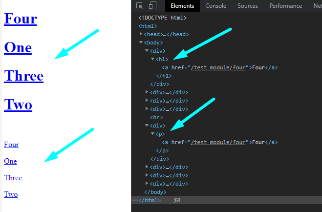
We have four items in this module: “One”, “Two”, “Three”, “Four”.
In the browser then we can see the two module insertions are different.
Example 2
In this example we use a custom parameter to change the colour of the text in a snippet.
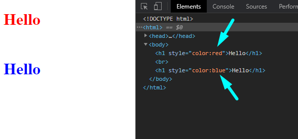
Here we’re using the custom parameter of “colour”. The first time we give it the value of “red”, and the second time we give it the value of “blue”.
{% component type: "snippet", alias: "test", colour: "red" %}
<br>
{% component type: "snippet", alias: "test", colour: "blue" %}
Inside the snippet we’re calling the custom parameter with this.params.colour. We using it to set inline styling, but it could just as easily be used to set a class.
<h1 style="color:{{this.params.colour}}">Hello</h1>
In the browser we see that one instance of the snippet is red and one is blue.
To extend this example we could use this to create a heading snippet. Section headings will frequently have the similar styling but different text.
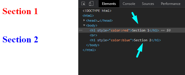
So here we’ve added one more custom parameter “sectionText” and given it the value of “Section 1” and “Section 2”.
{% component type: "snippet", alias: "test", colour: "red", sectionText: "Section 1" %}
<br>
{% component type: "snippet", alias: "test", colour: "blue", sectionText: "Section 2" %}
Then in our snippet we’ve retrieved the value of the sectionText custom parameter with this.params.sectionText.
<h1 style="color:{{this.params.colour}}">{{this.params.sectionText}}</h1>
Now in our browser we see that the text has been added to our snippet:
Example 3
In our final example we’ll use a custom parameter to change the fill colour of an SVG. This is a common application with logos that may be on different backgrounds.
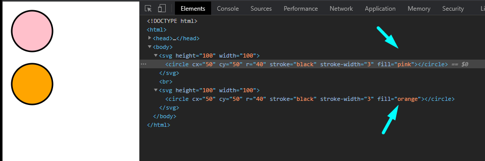
In our custom insertion we set a custom parameter called fillColour, and the value will be the fill colour of the SVG.
{% component type: "snippet", alias: "test", fillColour: "pink" %}
<br>
{% component type: "snippet", alias: "test", fillColour: "orange" %}
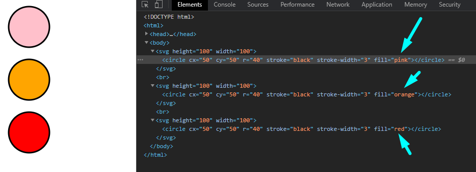
Then in our snippet we call the custom parameter fillColour, and we get the value of pink or orange for the fill of our circle.
<svg height="100" width="100">
    <circle cx="50" cy="50" r="40" stroke="black" stroke-width="3" fill="{{this.params.fillColour}}" />
</svg>
In the browser we see the background of the SVG is set to the fillColour custom parameter.
To extend this we could set a default fill colour by using the following logic in our snippet. We can interpret this as: if fillColour exists then insert fillColour, else insert “red”.
<svg height="100" width="100">
    <circle cx="50" cy="50" r="40" stroke="black" stroke-width="3" fill="
    {% if this.params.fillColour %}
        {{this.params.fillColour}}
    {% else %}
        red
    {% endif %}" />
</svg>
Using this component insertion.
{% component type: "snippet", alias: "test", fillColour: "pink" %}
<br>
{% component type: "snippet", alias: "test", fillColour: "orange" %}
<br>
{% component type: "snippet", alias: "test" %}
In the browser we see that the first two have their colour set with the fillColour custom parameter, and the third insertion falls-back to red, the default colour.
External Resources
There are currently no external resources available.
Please let us know if you have any other contributions or know of any helpful resources you'd like to see added here.
Questions?
We are always happy to help with any questions you may have.
Visit the Treepl Forum for community support and to search previously asked questions or send us a message at support@treepl.co and we will consult you as soon as possible.