Pages
Pages allow the creation and management of standard page content and folders. Pages can be arranged within folders, secured from unauthorised access, hidden from either site search or search engines, assigned to templates and given full SEO properties among various other settings.
Pages and Page Folders can contain all manner of website content which can be managed via the WYSIWYG editor, directly in Code View or via FTP.
Quick Start
Managing Page Items
Views
There are 2 different list views your Page items can be configured to display in, or switched to via the icons ( ) in the top right of the item view.
Depending on how the module is configured, some or all of these icons may be visible and the default view may be different to that of how other modules display.
List View ()
A direct listing of all the current module items, in a tabular layout, which can be clicked on to access their content. A typical view for singular, self contained modules.
Tree View ()
Relevant for nested module structures, this view shows all current module items, in a tabular layout, as folders (parent items) which can be clicked into to access a List View of their child module items.
Import / Export
Found under the main auxiliary menu (), you can import/export data to/from your Pages module where you can then further update your items in bulk using a spreadsheet application and re-import item data in an Excel file format (.xlsx).
If re-importing to update existing items, be sure to maintain the same 'External ID' values from those exported items.
Export the current items in order to get a template import file you can use for importing new data. If you're starting from scratch, first create a dummy item with some sample data so you can see the import format needed.
Import for Nested (Parent/Child) Modules
Nested modules include eCommerce (Products/Catalogs), Pages, Blogs, Events, Banners, Galleries & Sliders, FAQs, and any Custom Modules that have been configured to ‘Allow creating foreign items from other existing Custom Modules’.
The import file for such child modules will include a ‘Parents’ column which allows the imported item (row) to be assigned to a parent item (or its root level) via it’s URL path/slug. Or even multiple parents, if ‘Allow multiple parent items’ is configured in the parent module.
For example; if we have a parent module called “Web Technologies” with an item called “Javascript” and we wanted to assign an item from a nested module to it, we would include the following path in the child item’s “Parent” column cell: /web-technologies/javascript
The item’s full URL would then become /web-technologies/javascript/item-name
And if assigning to multiple parents, we would include each parent item’s slug separated by a semicolon (;), like so: /web-technologies/javascript;/web-technologies/liquid
Similarly, if we want to assign the child item to the root level parent module, include the module slug without any parent item slug included: /web-technologies
If the import file for the child items has empty ‘Parent’ cells or if the column is not present, the child items will be imported into the view you initiated the import from. So if you are viewing the parent items in ‘List View’ or are at the top level/root using ‘Tree View’, the imported items will be assigned to the root level of the parent module. Likewise, if you have navigated into a parent “folder” and initiate the import process, the child items will be assigned to the currently viewed “folder” (only if the Parent cell is empty or omitted from the file).
You can also assign child items as parents to other child items, in the same module, during the same import process. For example; if we have two child items called “Number type” and “Integer” an wanted “Integer” to be a child of “Number type”, then it’s Parent cell value would include the parent module’s root slug and the target child item’s slug, like so:
/web-technologies/number-type
Resulting in the item’s full URL to become /web-technologies/number-type/integer
The sequence of the imported items in the spreadsheet is not important here. They can be in any order.
URL Conflicts
If, upon attempting to create an imported item with the constructed parent/child URL, the URL already exists in your site, the item will be handled in one of two ways (based on the site’s setting in ‘Settings’ > ‘Misc’ > ‘Disable autocomplete for already taken URL slugs’):
- If setting is unchecked (URL autocomplete enabled) then the conflicting URL will be appended with an incrementing number.
- If setting is checked (URL autocomplete disabled) then the import will present an error for that item and skip any update/creation of the item.
URL list column
The ‘URL list’ column in an export file is for export display purposes only (to display a full construction of both parent and item slug paths). This column is ignored for imported data and item URLs are determined by the individual parent and slug values.
Other Errors
The import process will present an error of each imported item if any of the following conditions are encountered (and will skip that item from being updated/created):
- If multiple parent slugs are included in the Parent cell but the module is not configured with the setting “Allow multiple parent items”
- If multiple parent slugs are included in the Parent cell and one or more of those slugs do not match any existing parent module items (missing parent items will not be created during import).
- If the slug included in the Parent cell is the same as the item slug being updated/created (cannot assign itself as parent).
If an error is thrown on a child item that is elsewhere assigned, in the import file, to be a parent to other child items, then all of those child items will also be skipped during import, since their parent cannot be created.
Deleting
Found under the main auxiliary menu (), you can delete ALL Pages in bulk using the "Delete All Items" option.
Additionally, you can make bulk selections from the item list view (by ticking the checkboxes on the left of each item) and click the "DELETE SELECTION" button that will appear at the base of the list view.
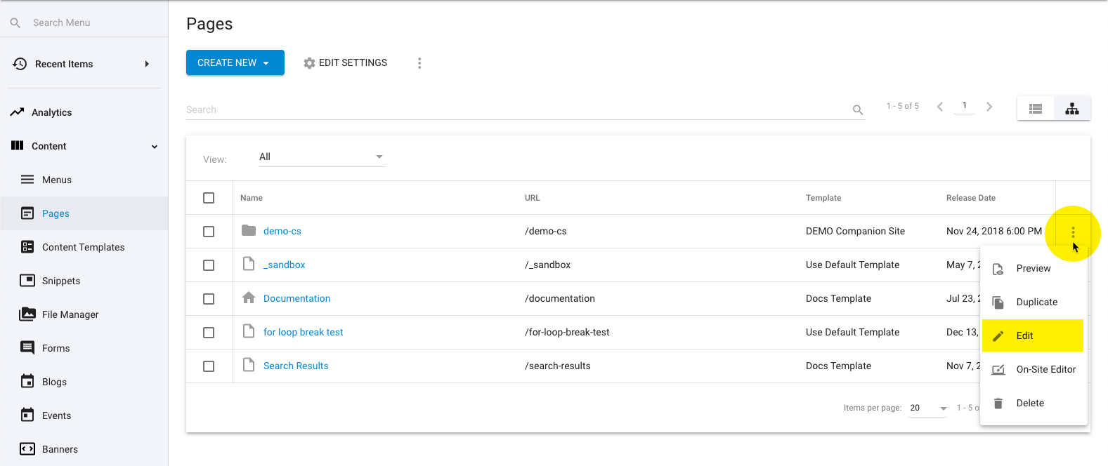
Individual items can be deleted either by expanding the auxiliary menu to the right of each item and selecting the "Delete" option or when on the item's edit page, click the trash can icon () in the lower right of the page.
Bulk Apply Template
After making a selection of module items, using the checkboxes to the left of each item, an “Apply Template” option will become available in the main auxiliary menu () allowing you to assign a template, in bulk, to the selected items.
Page Folders
The Pages module is a grouped/nested module by default, which means there are actually two modules configured together in a relationship. One to act as a parent Folder (the overall Page Folder itself) and the other as the individual child items (the Pages).
This module is configured to allow the creation of Page Folders or Pages and by clicking the “CREATE NEW” button it will give the option to create a ‘Page Folder’ or ‘Page’. Individual Pages can also be added when navigating within a Page Folder.
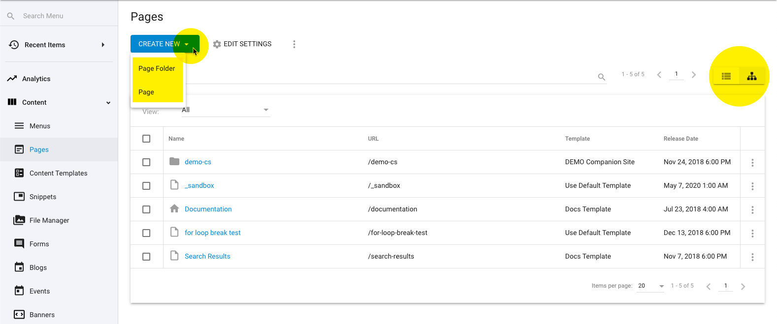
The ‘Tree View’ () will display any Page Folders you’ve created as well as any Pages that are outside of any folder. While the ‘List View’ () will display ALL Pages within the module, regardless of folder structure.
To create a Page within a Page Folder, simply enter the desired folder (by clicking the group name with the folder icon) and then follow the instructions below for ‘Populating Page Items’.
To assign an existing Page to a folder, edit the Page details and select the desired folder from the “Page Folder” field.
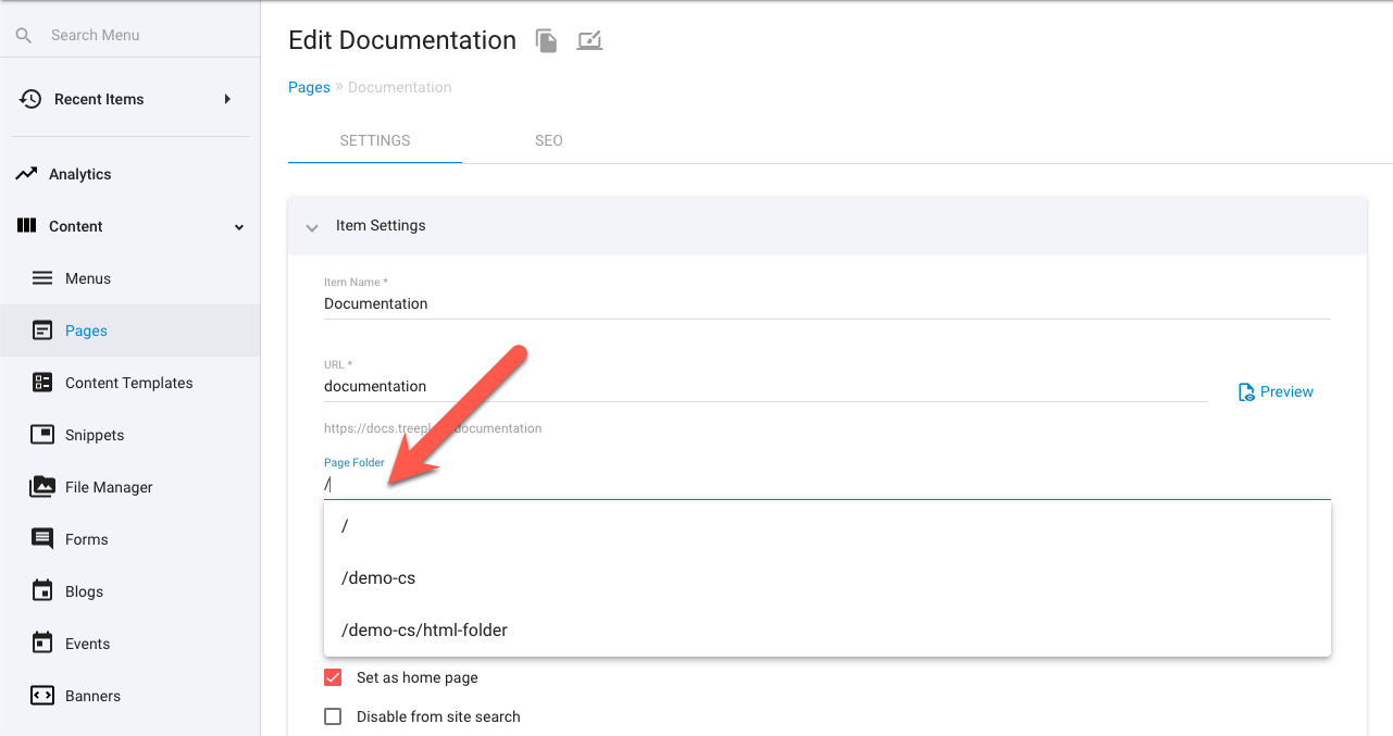
Editing Page Folders
Since clicking on a Page Folder will enter into that group's list view of items rather than going to its edit page, you can instead access the Page Folder's deatils by clicking the auxiliary menu () on the far right of its item row and choosing "Edit".
Populating Page Items
From the Pages item list view, click the “CREATE NEW” button at the top to start creating a new item or click directly on the name of any existing item in the list.
Upon editing an item you have access to the following options.
Settings
SEO
Displaying Page Items
You can render Page items to your website front-end in a variety of ways and places such as; other pages, layouts, templates, emails and just about anywhere else that supports Liquid.
Most commonly though, we would rely on the standard CMS behaviour to render these items as typical directories and HTML pages via their URL paths and linked to via your site menus and/or other page links.
To learn more about this modules rendering options, view the 'Component Tag Advanced Customisation' documentation link/s below.
Component Tag Advanced Customisation
See here for more detailed documentation on manually configuring the Page Folder component tag.
See here for more detailed documentation on manually configuring the Page component tag.
Searching Page Items
Searching within Pages can be achieved with a search form and the module’s component tag configured with the isSearchResult parameter.
Simple keyword based searches can be set up as well as more advanced search forms with specific system and custom fields searchable along with range searches for date and price/number fields.
You can configure a Page search with two parts; the search form and the module’s component tag. More on these parts below:
Component Tag with ‘isSearchResult’
To render the search results to the page and/or a collection, you need to configure the module’s component tag with the isSearchResult parameter set to true (see the Page component documentation for technical details).
{% component type: "module", source: "Page Folder", layout: "List", isSearchResult: "true" %}
This will allow the component to reference search parameters in the resulting URL.
URL search parameters will override any corresponding parameters in the component. If no search parameters are present in the URL, isSearchResult will be ignored.
You may want to separate the search form from the component tag if you want a dedicated search results page, or where you have a search input in the header or footer of all pages as so searches could be made from any page.
This method also alleviates a side-effect of the isSearchResult configured component whereby it will output all indexed items by default if no search query has been specified (ie: when a user first navigates to a search page).
If you do want one single search page, with both search form and component and don’t want to initially list all results, another solution to this is to wrap the component tag in a Liquid condition which looks for the presence of the prop_KeyWords parameter in the URL, like so:
{% if request.request_url.params.prop_KeyWords %}
    {% component type: "module", source: "Page Folder", layout: "List", isSearchResult: "true" %}
{% endif %}
Basic Search Form
A basic keyword based search form for Pages would be constructed like the following:
<form>
    <input type="hidden" name="prop_ModuleId" value="1234">
    <label>Keywords</label>
    <input type="text" name="prop_KeyWords" maxlength="255" value="{{request.request_url.params.prop_KeyWords | strip_html}}">
    <input type="submit" value="Search">
</form>
This form element includes a prop_KeyWords text input, prop_ModuleId hidden input, a submit button and no form action attribute.
The prop_ModuleId hidden input tells the search which module to search (replace ‘1234’ with the ID of your module).
The prop_KeyWords text input allows multiple keywords to be entered for searching.
The search logic combines multiple keywords with an AND operator, so items will be returned only if they include ALL keywords entered.
Currently, searching does not support any manual logic operators to be used in the keyword input field (such as; AND, OR, NOT...)
When the form is submitted, prop_ModuleId and prop_KeyWords, along with their values, will be passed as URL parameters for the isSearchResult configured component tag to interpret.
By default, the search form has no action attribute, so it will redirect to the current page with the URL parameter appended to the current page URL.
You can, instead, separate the search form from the ‘site_search’ component, having the module component on a separate page and sending the search query to that page instead of the current page.
To do this, you’d add the other page URL slug to the form element. So if the other page was “/search-results”, you’d adjust the form to include an action attribute as such:
<form action="/search-results">
Advanced Search Form
Building further on the basic form structure above, you can add Page specific fields to search their contents, either individually or combined with other fields and/or keyword queries.
The search logic combines all field queries with an AND operator, so items will be returned only if they include ALL the queries entered.
The fields (providing they are available to the module) that can be search upon include:
- Name
- URL (Slug)
- SKU Code
- Release Date
- Expiry Date
- Site Search Keywords
- Rating
- Description
- Any ‘Default Properties’ (eg: Categories, Tags, Author...)
- Any ‘Custom Properties’
- Module specific ‘System Properties’ (Price, Product Dimensions, Unit Type, Capacity...)
To add these fields to your search form, create an appropriate input with the name attribute configured like prop_PropertyName.
So, if you were adding a search field for a custom property called “Vehicle Colour”, the form input might look like this:
<input type="text" name="prop_VehicleColour">
Follow this same format for most other properties. Although you may like to change the input type to suit the type of data required.
For example, if our above “Vehicle Colour” property was actually a dropdown field with predefined colour values, you may choose to create a <select> element instead, like so:
<select name="prop_VehicleColour">
    <option value="Red">Red</option>
    <option value="Blue">Blue</option>
    <option value="Green">Green</option>
</select>
After the search form has been submitted, you might also like to keep the search queries filled in the search form fields, for better usability. So to do this you can pull the query parameters out of the URL and into the input values, like so:
<input type="text" name="prop_VehicleColour" value="{{request.request_url.params.prop_VehicleColour | strip_html}}">
Search Within Number Ranges
For property types such as dates, prices, ratings and numbers, you can search with a to-from/min-max range by adding _Min or _Max to the property name.
So let’s say you want to search for items within a certain date range, based on their release/expiry dates.
<input type="datetime-local" name="prop_ReleaseDate_Min">
<input type="datetime-local" name="prop_ExpiryDate_Max">
And to populate these fields with the searched values:
<input type="datetime-local" name="prop_ReleaseDate_Min" value="{{request.request_url.params.prop_ReleaseDate_Min | date: "%Y-%m-%dT%H:%M" | strip_html}}">
<input type="datetime-local" name="prop_ExpiryDate_Max" value="{{request.request_url.params.prop_ExpiryDate_Max | date: "%Y-%m-%dT%H:%M" | strip_html}}">
Searching for a minimum release date will return all items with a release date newer (or the same as) the query date. And likewise searching for a maximum expiry date will return all items with an expiry date older (or the same as) the query date.
Programmatically Search (without a form)
There may be times when you require the search results for a module based on constructed data, other than that of a user’s input into a search form.
You can achieve this with the use of the searchScope parameter on the module’s component tag (see the Page component documentation for technical details).
This parameter allows a search on the module without search parameters needed in the URL. Instead, search parameters are added to the value of this parameter. Therefore, this parameter can be used to output module specific search results from hard-coded (or Liquid constructed) values without the use of a search form.
The search queries are similar to that used in the above form based search method, but use JSON syntax for their construction.
Below is an example of a constructed searchScope configured component tag, with min/max release date search, keywords and multiple tags query:
{% component type: "module", source: "Page Folder", layout: "List", searchScope: "{'prop_ReleaseDate_Min':'2018-07-01', 'prop_ReleaseDate_Max':'2018-07-31', 'prop_KeyWords':'Your Keywords', 'prop_ItemTags':['tag1','tag2']}" %}
The search logic combines all field queries with an AND operator, so items will be returned only if they include ALL the queries entered.
Related Articles
- Site Settings & Management
Site Globals
Site Globals, under ‘Settings’, is where you can set up customised data points for your... - Extras
Image Processor
Treepl CMS utilises the ImageProcessingModule which allows you to perform image manipulations (such as resizing, cropping, quality/compression, filters, etc.) simply by adding URL query string parameters to your image source paths. - Content Modules
File Manager
The File Manager provides browserable and functional access to the site’s file storage. You can... - Liquid Components
countries
This component renders a form select element of all country names and country codes by default, and can also be used to output country codes/names to a Liquid collection. - Content Editing
Admin Editor (WYSIWYG/Code View) - Website Templates
*Bikes - Website Templates
*Clothing Store - Website Templates
Coffee - Website Templates
*Coworking - Website Templates
Digital Agency - Website Templates
Furniture - Website Templates
*Hair Salon - Website Templates
Max - Content Editing
On-Site Editor (OSE)
The OSE is an in-context-editor that allows for quick and simple editing and styling of on-page text content directly within the context of the page (while viewing the live website). - Content Editing
On-Site Editor (OSE) PRO
The On-Site Editor allows admin users to manage designated content from the front-end of the website in a more streamlined and intuitive manner.
External Resources
There are currently no external resources available.
Please let us know if you have any other contributions or know of any helpful resources you'd like to see added here.
Questions?
We are always happy to help with any questions you may have.
Visit the Treepl Forum for community support and to search previously asked questions or send us a message at support@treepl.co and we will consult you as soon as possible.