Change log

Products

Products are one of the most powerful and flexible modules in Treepl CMS. Create customised product schemas with multiple price points, catalogs, inventory tracked attributes/variables, SEO optimisation and more.

Well defined Products can make or break your online store and this module allows you a great deal of flexibility when creating a wide range of product types, from physical goods, digital downloads, recurring services, and gift vouchers.

Product Settings

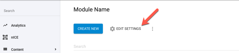
From the Products item list view, click the " EDIT SETTINGS" button to display a menu for further options, as detailed below.

Products - Edit

Settings

These settings relate to the overall Products options and functionality and how content might be managed by site administrators.

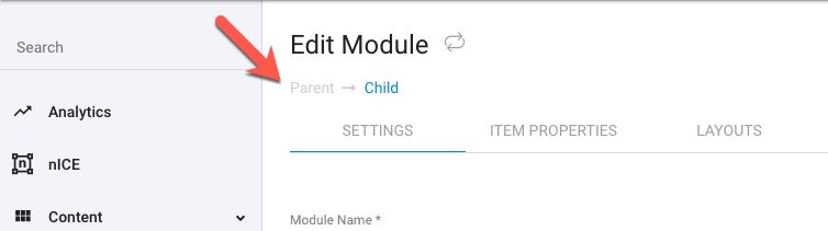
For nested modules, such as Blogs, Events, Banners, Galleries, FAQs, and any nested Custom Modules, you may wish to edit the settings for each of the 2 nested modules. You can easily switch between the 2 module's settings using the switcher at the top of page (under the modules name). The disabled, greyed out item, indicates the currently active module - while the highlighted linked item, provides a link to the connected module.

Products - Edit Parent/Child Switcher
Settings
Option
Description
Module Name
The Module Name to describe the type of content it will contain or the purpose it will serve.
URL

The system will generate a base URL derived from the module name given. You can however, adjust this URL path name if desired. This will set the directory structure for this content on your site. So, for example, if you set a Module's name as “Web Technologies” the URL for this module might be https://your-domain.com/web-technologies. And given an item within this module called “JavaScript”, the item might be accessed via the URL https://your-domain.com/web-technologies/javascript.

Changing an existing Modules URL may affect all of this Module's existing items URLs on your website.

Alternate Item name

Once your Module is configured and ready for adding items, the site admin will generally use the ‘Create New’ item button in the Module's list view. When the list view is changed to display in ‘Tree View’ mode (ie: when using nested/grouped modules) the admin will see a dropdown option referring to the name of the Module item to be created. By default this will show the name of the Module you've created, for example: “Create new… Staff List”. However, while “Staff List” might be appropriate for the overall Module name it’s not quite the right terminology for creating individual items. So instead, you can set this alternative naming to give your Module better context and usability, for example, changing the button option to: “Create New… Staff Member”.

Icon

Change the module item’s default list icon when using nested/grouped custom modules. This setting can be applied to the parent module and/or the child module to customise the item’s icons when being viewed in ‘Tree View’.
By default, in ‘Tree View’, parent items will have a folder icon () while child items will have a file icon ().

Use the add file icon () in this field to choose from a range of system icons or alternatively upload your own custom image.
Only uploaded images to the system directory can be used here. No external or absolute image paths are allowed.
The suggested icon dimensions are 24px x 24px and .svg file format is preferred, however, most other image sizes and formats should work.

Media Files Upload Folder

Here, you can set the location you want to exclusively use for this Module's media assets (when using any Media property type). This helps keep the file manager organized and prevents files from being uploaded into folders you don't want them stored in.

You will only be able to access the set folder from the media file field. Setting a folder here also prevents manual typing/pasting file paths into the media field and requires the user to use the file picker to select the media.

Notes

This allows you to add a custom message that will display in the admin at the top of the Module items list view. This can be used to describe the Module's use or providing instructions for the administrator.

Disable detail layout

If checked, this setting prevents all of this Module's items from having URLs that can be resolved/reached and the item's URL field will be set to disabled - disallowing the URL to be edited either from the admin or via front-end processes. This Module's `Detail Layout` option will also be hidden and set to `Don't Use` by default, preventing the item from using any detail layout and omitting the item from the automatic sitemap.xml file.

Site User Permissions

For front-end site users, permissions can be set to control how they can interact with the front-end APIs used for creating and/or modifying module items.

Settings can also be adjusted here to define the functions that these APIs trigger (such as Workflows and Autoresponders).

Create Module Item

The following options relate specifically to the 'Create Module Item' action.

Workflow
Option
Description
Select Workflows

The workflow notification/s that will be triggered upon a user taking this action.

Multiple workflows can be selected and will all be triggered at the same time.

Autoresponder

The autoresponder is an email sent out to the user after the form has been submitted from the front-end of the website.

Option
Description
Enable
Enable the autoresponder email to be sent.
Receiver

Determines who's email address to use for delivery of the autoresponder email.

Form sender
Use the email address of the user submitting the form.

Item owner
Use the email address of the assigned module item's owner.

Sender and owner
Use both email addresses of the user submitting the form and module item's owner.

If the autoresponder relates to the 'Create Module Item' action, both 'form sender' and 'item owner' will be the same. Therefore, all options will result in the same autoresponder delivery.

Template
The Email Template to be used for the autoresponder email.
From Name

The display name used for the email sender.

This field supports Liquid which can be used to insert dynamic content such as member details, form submission details or even data from other modules.

From Email
The email address used for the email sender and reply address.

If using a non-verified email domain you’ll see a warning message and icon (). For more info on Email Domain verification see here.

Subject

The subject line used for the autoresponder email.

This field supports Liquid which can be used to insert dynamic content such as member details, form submission details or even data from other modules.

Body

The content of your autoresponder email.

This field supports Liquid which can be used to insert dynamic content such as member details, form submission details or even data from other modules.

API Restrictions

Here you can allow website users to submit, or otherwise manipulate, the Module's items from the front-end of the website. Furthermore, these options allow you to control the permissions those users have.

Option
Description
Enable endpoint/Checkbox
Turns the endpoint on (if checked) or off (if unchecked) for the site, allowing frontend user access based on the additional settings below.
Allowed to the Following Type of Users

Logged in users (default)
Specifies that the user needs to be logged in to perform this action.

Users from the following secure zones
Specifies that the user needs to be logged in to one of the selected secure zones to perform this action.

Admin Users
Specifies that the logged in user needs to be of an 'Admin User' role in the CRM to perform this action.

To facilitate module item editing from the front-end you’ll need to add the ‘Create/Update/Delete Item’ form/s (found in the Components Manager) to your layouts or pages, or otherwise pass the required item data to the API endpoints.

Update Module Item

The following options relate specifically to the 'Update Module Item' action.

Workflow
Option
Description
Select Workflows

The workflow notification/s that will be triggered upon a user taking this action.

Multiple workflows can be selected and will all be triggered at the same time.

Autoresponder

The autoresponder is an email sent out to the user after the form has been submitted from the front-end of the website.

Option
Description
Enable
Enable the autoresponder email to be sent.
Receiver

Determines who's email address to use for delivery of the autoresponder email.

Form sender
Use the email address of the user submitting the form.

Item owner
Use the email address of the assigned module item's owner.

Sender and owner
Use both email addresses of the user submitting the form and module item's owner.

If the autoresponder relates to the 'Create Module Item' action, both 'form sender' and 'item owner' will be the same. Therefore, all options will result in the same autoresponder delivery.

Template
The Email Template to be used for the autoresponder email.
From Name

The display name used for the email sender.

This field supports Liquid which can be used to insert dynamic content such as member details, form submission details or even data from other modules.

From Email
The email address used for the email sender and reply address.

If using a non-verified email domain you’ll see a warning message and icon (). For more info on Email Domain verification see here.

Subject

The subject line used for the autoresponder email.

This field supports Liquid which can be used to insert dynamic content such as member details, form submission details or even data from other modules.

Body

The content of your autoresponder email.

This field supports Liquid which can be used to insert dynamic content such as member details, form submission details or even data from other modules.

API Restrictions

Here you can allow website users to submit, or otherwise manipulate, the Module's items from the front-end of the website. Furthermore, these options allow you to control the permissions those users have.

Option
Description
Enable endpoint/Checkbox
Turns the endpoint on (if checked) or off (if unchecked) for the site, allowing frontend user access based on the additional settings below.
Allowed to the Following Type of Users

Logged in users (default)
Specifies that the user needs to be logged in to perform this action.

Users from the following secure zones
Specifies that the user needs to be logged in to one of the selected secure zones to perform this action.

Admin Users
Specifies that the logged in user needs to be of an 'Admin User' role in the CRM to perform this action.

Ownership Restriction

Only Owner allowed (default)
Restricts this action to only the item's owner.

Anyone allowed
Permits this action for any user regardless of the item's ownership.

The above 'Allowed to the Following Type of User' permission is used in conjunction with this option. eg: If you've selected a specific Secure Zone required for the types of users and selected only the owner can update, the owner must also belong to the selected secure zone to have permission to access the endpoint.

To facilitate module item editing from the front-end you’ll need to add the ‘Create/Update/Delete Item’ form/s (found in the Components Manager) to your layouts or pages, or otherwise pass the required item data to the API endpoints.

Delete Module Item

The following options relate specifically to the 'Delete Module Item' action.

Workflow
Option
Description
Select Workflows

The workflow notification/s that will be triggered upon a user taking this action.

Multiple workflows can be selected and will all be triggered at the same time.

Autoresponder

The autoresponder is an email sent out to the user after the form has been submitted from the front-end of the website.

Option
Description
Enable
Enable the autoresponder email to be sent.
Receiver

Determines who's email address to use for delivery of the autoresponder email.

Form sender
Use the email address of the user submitting the form.

Item owner
Use the email address of the assigned module item's owner.

Sender and owner
Use both email addresses of the user submitting the form and module item's owner.

If the autoresponder relates to the 'Create Module Item' action, both 'form sender' and 'item owner' will be the same. Therefore, all options will result in the same autoresponder delivery.

Template
The Email Template to be used for the autoresponder email.
From Name

The display name used for the email sender.

This field supports Liquid which can be used to insert dynamic content such as member details, form submission details or even data from other modules.

From Email
The email address used for the email sender and reply address.

If using a non-verified email domain you’ll see a warning message and icon (). For more info on Email Domain verification see here.

Subject

The subject line used for the autoresponder email.

This field supports Liquid which can be used to insert dynamic content such as member details, form submission details or even data from other modules.

Body

The content of your autoresponder email.

This field supports Liquid which can be used to insert dynamic content such as member details, form submission details or even data from other modules.

API Restrictions

Here you can allow website users to submit, or otherwise manipulate, the Module's items from the front-end of the website. Furthermore, these options allow you to control the permissions those users have.

Option
Description
Enable endpoint/Checkbox
Turns the endpoint on (if checked) or off (if unchecked) for the site, allowing frontend user access based on the additional settings below.
Allowed to the Following Type of Users

Logged in users (default)
Specifies that the user needs to be logged in to perform this action.

Users from the following secure zones
Specifies that the user needs to be logged in to one of the selected secure zones to perform this action.

Admin Users
Specifies that the logged in user needs to be of an 'Admin User' role in the CRM to perform this action.

Ownership Restriction

Only Owner allowed (default)
Restricts this action to only the item's owner.

Anyone allowed
Permits this action for any user regardless of the item's ownership.

The above 'Allowed to the Following Type of User' permission is used in conjunction with this option. eg: If you've selected a specific Secure Zone required for the types of users and selected only the owner can update, the owner must also belong to the selected secure zone to have permission to access the endpoint.

To facilitate module item editing from the front-end you’ll need to add the ‘Create/Update/Delete Item’ form/s (found in the Components Manager) to your layouts or pages, or otherwise pass the required item data to the API endpoints.

Update Draft Module Item

The following options relate specifically to the 'Update Draft Module Item' action.

Workflow
Option
Description
Select Workflows

The workflow notification/s that will be triggered upon a user taking this action.

Multiple workflows can be selected and will all be triggered at the same time.

Autoresponder

The autoresponder is an email sent out to the user after the form has been submitted from the front-end of the website.

Option
Description
Enable
Enable the autoresponder email to be sent.
Receiver

Determines who's email address to use for delivery of the autoresponder email.

Form sender
Use the email address of the user submitting the form.

Item owner
Use the email address of the assigned module item's owner.

Sender and owner
Use both email addresses of the user submitting the form and module item's owner.

If the autoresponder relates to the 'Create Module Item' action, both 'form sender' and 'item owner' will be the same. Therefore, all options will result in the same autoresponder delivery.

Template
The Email Template to be used for the autoresponder email.
From Name

The display name used for the email sender.

This field supports Liquid which can be used to insert dynamic content such as member details, form submission details or even data from other modules.

From Email
The email address used for the email sender and reply address.

If using a non-verified email domain you’ll see a warning message and icon (). For more info on Email Domain verification see here.

Subject

The subject line used for the autoresponder email.

This field supports Liquid which can be used to insert dynamic content such as member details, form submission details or even data from other modules.

Body

The content of your autoresponder email.

This field supports Liquid which can be used to insert dynamic content such as member details, form submission details or even data from other modules.

API Restrictions

Here you can allow website users to submit, or otherwise manipulate, the Module's items from the front-end of the website. Furthermore, these options allow you to control the permissions those users have.

Option
Description
Enable endpoint/Checkbox
Turns the endpoint on (if checked) or off (if unchecked) for the site, allowing frontend user access based on the additional settings below.
Allowed to the Following Type of Users

Logged in users (default)
Specifies that the user needs to be logged in to perform this action.

Users from the following secure zones
Specifies that the user needs to be logged in to one of the selected secure zones to perform this action.

Admin Users
Specifies that the logged in user needs to be of an 'Admin User' role in the CRM to perform this action.

Ownership Restriction

Only Owner allowed (default)
Restricts this action to only the item's owner.

Anyone allowed
Permits this action for any user regardless of the item's ownership.

The above 'Allowed to the Following Type of User' permission is used in conjunction with this option. eg: If you've selected a specific Secure Zone required for the types of users and selected only the owner can update, the owner must also belong to the selected secure zone to have permission to access the endpoint.

To facilitate module item editing from the front-end you’ll need to add the ‘Create/Update/Delete Item’ form/s (found in the Components Manager) to your layouts or pages, or otherwise pass the required item data to the API endpoints.

Publish Draft Module Item

The following options relate specifically to the 'Publish Draft Module Item' action.

Workflow
Option
Description
Select Workflows

The workflow notification/s that will be triggered upon a user taking this action.

Multiple workflows can be selected and will all be triggered at the same time.

Autoresponder

The autoresponder is an email sent out to the user after the form has been submitted from the front-end of the website.

Option
Description
Enable
Enable the autoresponder email to be sent.
Receiver

Determines who's email address to use for delivery of the autoresponder email.

Form sender
Use the email address of the user submitting the form.

Item owner
Use the email address of the assigned module item's owner.

Sender and owner
Use both email addresses of the user submitting the form and module item's owner.

If the autoresponder relates to the 'Create Module Item' action, both 'form sender' and 'item owner' will be the same. Therefore, all options will result in the same autoresponder delivery.

Template
The Email Template to be used for the autoresponder email.
From Name

The display name used for the email sender.

This field supports Liquid which can be used to insert dynamic content such as member details, form submission details or even data from other modules.

From Email
The email address used for the email sender and reply address.

If using a non-verified email domain you’ll see a warning message and icon (). For more info on Email Domain verification see here.

Subject

The subject line used for the autoresponder email.

This field supports Liquid which can be used to insert dynamic content such as member details, form submission details or even data from other modules.

Body

The content of your autoresponder email.

This field supports Liquid which can be used to insert dynamic content such as member details, form submission details or even data from other modules.

API Restrictions

Here you can allow website users to submit, or otherwise manipulate, the Module's items from the front-end of the website. Furthermore, these options allow you to control the permissions those users have.

Option
Description
Enable endpoint/Checkbox
Turns the endpoint on (if checked) or off (if unchecked) for the site, allowing frontend user access based on the additional settings below.
Allowed to the Following Type of Users

Logged in users (default)
Specifies that the user needs to be logged in to perform this action.

Users from the following secure zones
Specifies that the user needs to be logged in to one of the selected secure zones to perform this action.

Admin Users
Specifies that the logged in user needs to be of an 'Admin User' role in the CRM to perform this action.

Ownership Restriction

Only Owner allowed (default)
Restricts this action to only the item's owner.

Anyone allowed
Permits this action for any user regardless of the item's ownership.

The above 'Allowed to the Following Type of User' permission is used in conjunction with this option. eg: If you've selected a specific Secure Zone required for the types of users and selected only the owner can update, the owner must also belong to the selected secure zone to have permission to access the endpoint.

To facilitate module item editing from the front-end you’ll need to add the ‘Create/Update/Delete Item’ form/s (found in the Components Manager) to your layouts or pages, or otherwise pass the required item data to the API endpoints.

Option
Description
Specify Item Expiry Date

Enables logged in users to edit the Expiry Date and/or Days before Expiry for their submitted items for this Module.

The Expiry Date and Days before Expiry fields will be included in the ‘Create/Update Item’ form (found in the Components Manager).

Requires Approval

Submitted items for this Module will be set as disabled.
A website admin will be required to enable the item via the admin in order to approve the item and have it published to the website front-end.
Use in conjunction with the Select Workflows option below to be notified of user submitted items.

Secure Zones

Here default secure zone/s can be set in which newly created items will automatically be assigned to. This applies both to items created within the admin and via the front-end of the website.

Option
Description
Select Secure Zones
A list of available Secure Zones. Multiple Secure Zones can be selected.
Advanced Settings

Advanced settings for configuring your Module functionality and behaviour such as nested items and admin list view options.

Option
Description
Enable bookings

When enabled, this will show the capacity field in module item edit page and allows for the subscription logic to work for item.

Allow multiple parent items

In the case of grouped/nested module structures, if this option is enabled for the child module, it will display a tab with the name of the Parent module when editing child items. Likewise the name of the Child module will be displayed as a tab for the Parent module item view.

This tab will allow the selecting of multiple parent relationships of which their URLs can be uses to access the child items.

Additionally, the multiple URLs now created for an item will be listed as preview links along with the primary URL on the item's edit page.

Allow creating foreign items from other existing Modules

Here you can enable the visual grouping of Modules within each other - to form sub items within a parent item.

This allows for more intuitive editing of content items when a parent/child relationship is desired. It also allows deeper, more complex content structures to be created where parent/child content is needed to be displayed on your website.

You will not be able to set a module here if that module is already being used as a parent/child module elsewhere.

Choose Module

Select the existing Module to nest within the Module you are currently working in.

When creating child items, you'll be prompted to select the parent item to be assigned to and this will also determine that items URL structure.
For example, having a parent Module called 'Web Technologies' with an item 'Javascript', assigning a sub item to 'Javascript' called 'String' might produce a URL to the sub item like so https://your-domain.com/web-technologies/javascript/string.
The sub item named 'String', although belonging to its own Module (in this case called 'Technology Types') no longer takes on its own URL structure of https://your-domain.com/technology-types/string because it has now been assigned to the parent Module.

See the External Resources section below for a basic demo of Modules in action.

Module Items View Settings

With Modules in a nested structure, items from the chosen Module can now be nested under items of the current Module and therefore it makes sense to display them to the administrator that way.
So here you can configure how the list of items can be displayed in the admin area and which view should be the default.

Option
Description
Allow Items Tree View

Enables the option to view parent level items as folders, that when clicked, show only a list of their child items (rather than clicking through to edit the parent item itself).
In order to edit the parent item, click on the pencil icon associated with that item on the far right of the list.

Allow Items List View

Enables the option to view ALL items, in the child Module, as a list without the need to drill down into separate parent folders.
This option is not available for the parent Module.

In this view you can still determine the item grouping by looking at the URL shown in the list view, as it will show the directory structure including the parent items URL.

You can also use the search field at the top of the list to filter items based on both their name AND the URL contents.

Allow Simplified Tree View

Enables a more simplistic and condensed view when listing and creating items. Including the ability to edit, delete, move order/nest items all from the one list view.

This option is ideal for managing parent level items that only require basic settings (such as a name and hierarchy) and where the details of the item are generally not needing to be accessed.

Default View
Set which of the above view options are default.

Creating New Items

With Modules in a nested structure, you'll have the option to allow (or restrict) both the creation of parent level items and child items from within the current Module itself - without the administrator having to navigate multiple separate modules in order to manage complex content structures.
The options here allow granular control on how you set this up to manage which items can be added and from where.

For example, you could restrict the creation of parent items altogether - allowing only child items to be created.
Or perhaps, only allow child items to be created when the administrator is within a parent item - to avoid items being created in the wrong place.

Sub items can however, still be added/edited from within its own Module as well if that makes more sense for the administrator.

Item Properties

Here you can define the various options that might be available when creating Product items, such as the system data fields to be used, default expiry, SEO settings, custom fields, and more...

Default Properties

The default properties relate to system fields and settings available to this module.

Option
Description
Default Template
A list of available Content Templates. The selected Content Template will be applied to newly created Module items by default. Both from within the admin and user submitted.
Enable Multiple Detail Layouts

Show the Detail Layout option when editing module items.
This allows the website administrators to select from multiple detail layouts (if multiple Detail Layouts have been created).

Does not affect ‘Create/Update Item’ form fields for user submitted items.

Multiple Detail Layouts are only available in Pro plans or higher.

Enable Release Date

Show the Release Date option when editing module items.
This allows the website administrators to set a date and time in which the item will be published and available for access on the website front-end.

Does not affect ‘Create/Update Item’ form fields for user submitted items.

Enable Expiration Date

Show the Expiration Date option when editing module items.
This allows the website administrators to set a date and time in which the item will be unpublished and no longer available for access on the website front-end.

Does not affect ‘Create/Update Item’ form fields for user submitted items.

Item Expire

When a number of days is activated, the expiry date will automatically be calculated based on the number of days set.

Does not affect ‘Create/Update Item’ form fields for user submitted items.

The number of days setting is not used to calculate expiry dates for user submitted items. For this, use the expiry date fields in the ‘Create/Update Item’ form.

Enable Weighting

Show the Weighting option when editing module items.
This allows the website administrators to set a numerical value in which the item will be sorted by in default list views on the website front-end.
By default, higher values see the item listed above lower value items.
When a weighting value is applied to an item it overrides the default alpha-numeric sorting of lists (based on the item Name).

Does not affect ‘Create/Update Item’ form fields for user submitted items. The Weighting option is always available by default in the ‘Create/Update Item’ form.

Enable Categories

Show the Categories option when editing module items.
This allows the website administrators to assign global Categories for various display/filtering/sorting options on the website front-end.

Does not affect ‘Create/Update Item’ form fields for user submitted items. Categories cannot be assigned during the user submitted/editing process.

Root Category

Select the parent category that will define the available child categories when adding/editing items. This allows you to lock out other unrelated category groups from cluttering up the category dropdown for this module's items.

Enable Tags

Show the Tags option when editing module items.
This allows the website administrators to assign module specific Tags for various display/filtering/sorting options on the website front-end.

Does not affect ‘Create/Update Item’ form fields for user submitted items. Tags cannot be assigned during the user submitted/editing process.

Enable Author

Show the Author option when editing module items.
This allows the website administrators to assign a system Author for various display/filtering/sorting options on the website front-end.

This option also adds the Author field to the ‘Create/Update Item’ form for user submitted items.

Disable All Items From Site Search

Sets the ‘Disable From Site Search’ option to true, as a default, for all module items created after this setting has been enabled.

Does not affect ‘Create/Update Item’ form fields for user submitted items. ‘Disable From Site Search’ cannot be assigned during the user submitted/editing process.

Show New Items for Search Engines

Sets the ‘Show this page for search engines’ option to true (under the SEO tab), as a default, for all module items created after this setting has been enabled.

Does not affect ‘Create/Update Item’ form fields for user submitted items. ‘Show this page for search engines’ cannot be assigned during the user submitted/editing process.

Default Priority

Sets the ‘SEO Priority’ value (under the SEO tab) for all module items created after this value has been set.

Does not affect ‘Create/Update Item’ form fields for user submitted items. ‘SEO Priority’ cannot be assigned during the user submitted/editing process.

Custom Properties

Here you can add custom field types to your Module setup. These new properties will then be available for you to save data against and sort/filter by on the website front-end.

Create New Property

Click the '+ Create New Property' button to start adding custom fields to your module.

Give your new field a relevant name. This name will be used as the data handle in which to render the fields value in your Layouts.

Field Types allow you to select the appropriate input type for your data requirements.

When creating a custom property, the Mandatory checkbox allows you to set the field as required when an item is being created via the admin AND via the website front-end as a user submitted item.

Be sure to save the new custom property to apply it to your Module setup.

The various input field types are listed below:

Type
Data
Description
CRM Record
number
(CRM Record ID)
Allows the selection of a CRM Record (by Email) to create a relationship.
The linked record‘s ID is included with the current items liquid data.
Only one item is able to be selected per CRM Record field, however, multiple CRM Record fields can be added to your Module setup.
When populating a module item, upon focusing a CRM Record field, an empty search will be performed displaying a dropdown of up to the first 50 items found (for performance reasons). Further typing will perform live searches based on the entered characters matching to the record email address.

Only CRM Records with appropriate permission applied will be available to select in CRM Record fields (Due to GDPR/privacy compliance).

Data Source
number
(Item ID)
Allows the selection of another Module item (by Name) to create a relationship.
The linked item's ID, Name and URL are included with the current items liquid data.
Only one item is able to be selected per Data Source field, however, multiple Data Source fields can be added to your Module setup.
When populating a module item, upon focusing a Data Source field, an empty search will be performed displaying a dropdown of up to the first 50 items found (for performance reasons). Further typing will perform live searches based on the entered characters matching to the item name.
Date Time
number
(seconds since 1970)
Allow a date and time to be set via a date/time picker.
List (Checkbox List)
string
(comma separated values)
Allow multiple options to be selected from a list of available options as checkboxes.
List (Dropdown List)
string
(comma separated values)
Allow a single option to be selected from a dropdown list of available options.
Also with the additional option to switch to a multi-select box where multiple options can be selected from a list of available options.
List (Radio List)
string
(comma separated values)
Allow a single option to be selected from a list of available options as radio buttons.
Media
string
(local path to file)
A file input allowing website administrators to select or upload files from the File Manager.
With user submitted items from the website front-end, this provides a file upload field.

When rendering a media property value (filename/path) via Liquid, the filename will be URL encoded for correct use in HTML attributes. The encoded link will also be provided in the File Manager when using the 'copying to clipboard' function.

Multiline (Text)
string
Multiline inputs allow larger amounts of text to be entered along with line breaks. The following options can be enable for this field type:

Code View: Enables the admin editor interface to allow Code View for advanced code content formatting and markup control.
WYSIWYG: Enables the admin editor interface to allow WYSIWYG view for advanced content formatting and markup control.

Both options can be enable to show a toggle state between Code View and WYSIWYG mode. If neither option is checked, the admin interface will display a basic textarea field with no formatting options.
Number
number
Accepts only whole numbers (positive or negative).
Decimal values are rounded to their nearest whole number.
Single Line (Text)
string
String inputs allow for a single line of text.
True False (Boolean)
boolean
(number 0 or 1)
Booleans allow only a true or false selection. When not selected its submitted value will be blank and when selected its value is on.

Once custom properties have been created they’ll be listed on the page where you can further edit, delete or re-order them.

Converting Custom Properties

If you later need to change a custom property’s field type to a different field type you can do so here, using the same interface.
Simply click on the custom property name, or its pencil icon and make the required change/s.

Changing field types can destroy or change existing data associated with those fields. Below is a conversion table describing the data transformation likely to occur.

Existing Property
Conversion Property
Transformation
Data Source
number
(Item ID)
Data Source
-
Date Time
Use as number of seconds from 1970
List (Checkbox List)
Convert to string of selected values. Add value as prevalue
List (Dropdown List)
List (Listbox List)
List (Radio List)
Number
Set number value
Text (Multiline)
Convert to string
Text (String)
WYSIWYG
True False (Boolean)
If number > 0 then true otherwise false
Date Time
number
(seconds since 1970)
Data Source
Set number value
Date Time
-
List (Checkbox List)
Convert to string of selected values. Add value as prevalue
List (Dropdown List)
List (Listbox List)
List (Radio List)
Number
set number value
Text (Multiline)
Convert number to string
Text (String)
WYSIWYG
True False (Boolean)
If number > 0 then true otherwise false
List (Checkbox List)
List (Dropdown List)
List (Listbox List)
List (Radio List)
string
(coma separated values)
Data Source
Try parse as number. If failed set empty
Date Time
Try parse as number and create date by seconds. If failed set empty
List (Checkbox List)
If multi-select type is converting to a single-select type, than set value to first value from the coma separated values
List (Dropdown List)
List (Listbox List)
List (Radio List)
Number
Try parse as number. If failed set empty
Text (Multiline)
Set csv string as text
Text (String)
WYSIWYG
True False (Boolean)
Try parse as number. If number > 0 then true otherwise false
Number
number
Data Source
set number value
Date Time
Use as number of seconds from 1970
List (Checkbox List)
Convert to string of selected values. Add value as prevalue
List (Dropdown List)
List (Listbox List)
List (Radio List)
Number
-
Text (Multiline)
Convert number to string
Text (String)
WYSIWYG
True False (Boolean)
If number > 0 then true otherwise false
Text (Multiline)
Text(String)
WYSIWYG
string
Data Source
Try parse as number. If failed set empty string
Date Time
Try parse as number and create date by seconds. If failed set empty string
List (Checkbox List)
Try parse csv string as values. Add value as prevalue
List (Dropdown List)
List (Listbox List)
List (Radio List)
Number
Try parse as number. If failed set empty string
Text (Multiline)
Set text
Text (String)
WYSIWYG
True False (Boolean)
If empty then false otherwise true
True False (Boolean)
boolean
(number 0 or 1)
Data Source
Set 0 or 1
Date Time
Set empty
List (Checkbox List)
Convert number to string of selected values. Add value as prevalue
List (Dropdown List)
List (Listbox List)
List (Radio List)
Number
Set 0 or 1
Text (Multiline)
Set 0 or 1 as string
Text (String)
WYSIWYG
True False (Boolean)
-

Layouts

Layouts are the containers for an item's data to be rendered into, along with your custom markup. They are output by way of their associated component tag.
eg:

{% component type: "module", source: "Products", layout: "List" %}

When the component is output it loops through all of its relevant items and renders their data into the specified Layout, as defined by the layout parameter of the component tag.
In other words, the Layout acts as a type of template for displaying the Product's data.

You create your HTML markup or custom code and insert something similar to “data merge tags” by way of Liquid objects (eg: {{this['name']}} would render the item’s name).

List Layouts

Layouts of type ‘List’ are typically used for rendering repeating data sets. So, if the component you've configured retrieves 3 items, the List Layout will be rendered 3 times, each with a different item’s data being inserted within a defined markup.

Here is a simple example of how the Layout works, rendering a heading with the item's name as a link:

<div>
    <h2><a href="{{this['Url']}}">{{this['Name']}}</a></h2>
</div>

Using the example above of 3 items, the result on the website's front-end would look something like this:

<div>
    <h2><a href="/module-url/Product-1">Product 1</a></h2>
</div>
<div>
    <h2><a href="/module-url/Product-2">Product 2</a></h2>
</div>
<div>
    <h2><a href="/module-url/Product-3">Product 3</a></h2>
</div>

Detail Layouts

Layouts of type ‘Detail’ are typically used for rendering a single item's detail view, as displayed when browsing to that item’s unique URL.

Here is a simple example of how the detail Layout could look, rendering a heading with the item's name and the item's description field:

<div>
    <h2>{{this['Name']}}</h2>
    <div>
        {{this['Description']}}
    </div>
</div>

So, as per the example above, if viewing the first Product, the Layout would render something like this:

<div>
    <h2>Product 1</h2>
    <div>
        This is the description content of Product 1.
    </div>
</div>

For Products, there is a range of additional functionality you can insert on either product list or detail layouts.

Adding/Editing Layouts

You have the freedom of editing these layouts as you need to, with any HTML, CSS or JS as appropriate for your project. As well as creating unlimited, additional layouts.

Click the 'ADD NEW LAYOUT' button at the top to create additional list or detail layouts.

You can then add your custom markup and insert dynamic Liquid objects into your layout. Using the ' Properties' manager (found at the top right of the editor), simply click on the desired Liquid object name from the list to have it inserted at your cursors position within your markup, or click on the copy icon () to copy it to your clipboard.

Additionally, you can even add other modules inside of these Layouts, just as you might insert them onto a regular page. Simply click on the ' Components' manager (found at the top right of the editor) and follow the prompts to configure any additional component tags for the desired data output.

Table

This setting allows you to customise the column headers in the table/list view of module items in the admin. Allowing you to provide a better editing experience for you and the site admins.

For example, looking at a list of products, you’d likely want to see, and sort by, different columns of data than you would for a list of gallery slides or a list of staff members.

Reposition or Remove Table Columns

The Tables interface shows a representation of the current column headers which can be repositioned (via drag and drop), or deleted (via the x () icon, shown on hover).

Any changes made to the headers here are saved automatically.

Editing Table Columns

You can add additional columns to your module list view by clicking the “Add New Column” button, or you can edit existing ones via the pencil () icon (shown next to the column label on hover).

Column options are as follows:

Option
Description
Column Name
The display name shown in the column header
Property
The data field from your module items to display in the column
Width
The default column width (in pixels)
Mobile Width
The column width (in pixels) when viewed on a mobile device
Hide on Mobile
Allows hiding of the column when viewed on mobile devices

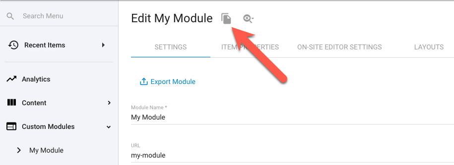
Duplicating the Module

This option allows you to copy an entire module setup, including all of it's settings and properties, but excluding it's individual items (these can be exported and re-imported into the new module if needed). You'll be prompted for a new module name and URL during the duplication process.

This option is accessed when editing a module's settings via the duplicate icon found next to the module name at the top of the 'Settings' screen.

Duplicate Module

Duplication of modules is available on the PRO plan and higher.

Duplication of built-in system modules is available, however, they will be converted to regular Custom Modules void of their specific System Properties.

Managing Product Items

Views

There are 3 different list views your Product items can be configured to display in, or switched to via the icons ( ) in the top right of the item view.

Depending on how the module is configured, some or all of these icons may be visible and the default view may be different to that of how other modules display.

List View ()

A direct listing of all the current module items, in a tabular layout, which can be clicked on to access their content. A typical view for singular, self contained modules.

Tree View ()

Relevant for nested module structures, this view shows all current module items, in a tabular layout, as folders (parent items) which can be clicked into to access a List View of their child module items.

Simplified Tree View ()

Relevant for nested module structures, this view shows all current module items (parent items) in a simplified list of items only. These can be reordered or nested via drag and drop or further edited via the auxiliary menu () visible next to the item on hover.

For more details on these view options see the module ‘Advanced Settings’ section above.

Import / Export

Found under the main auxiliary menu (), you can import/export data to/from your Products module where you can then further update your items in bulk using a spreadsheet application and re-import item data in an Excel file format (.xlsx).

If re-importing to update existing items, be sure to maintain the same 'External ID' values from those exported items.

Export the current items in order to get a template import file you can use for importing new data. If you're starting from scratch, first create a dummy item with some sample data so you can see the import format needed.

Import for Nested (Parent/Child) Modules

Nested modules include eCommerce (Products/Catalogs), Pages, Blogs, Events, Banners, Galleries & Sliders, FAQs, and any Custom Modules that have been configured to ‘Allow creating foreign items from other existing Custom Modules’.

The import file for such child modules will include a ‘Parents’ column which allows the imported item (row) to be assigned to a parent item (or its root level) via it’s URL path/slug. Or even multiple parents, if ‘Allow multiple parent items’ is configured in the parent module.

For example; if we have a parent module called “Web Technologies” with an item called “Javascript” and we wanted to assign an item from a nested module to it, we would include the following path in the child item’s “Parent” column cell: /web-technologies/javascript

The item’s full URL would then become /web-technologies/javascript/item-name

And if assigning to multiple parents, we would include each parent item’s slug separated by a semicolon (;), like so: /web-technologies/javascript;/web-technologies/liquid

Similarly, if we want to assign the child item to the root level parent module, include the module slug without any parent item slug included: /web-technologies

If the import file for the child items has empty ‘Parent’ cells or if the column is not present, the child items will be imported into the view you initiated the import from. So if you are viewing the parent items in ‘List View’ or are at the top level/root using ‘Tree View’, the imported items will be assigned to the root level of the parent module. Likewise, if you have navigated into a parent “folder” and initiate the import process, the child items will be assigned to the currently viewed “folder” (only if the Parent cell is empty or omitted from the file).

You can also assign child items as parents to other child items, in the same module, during the same import process. For example; if we have two child items called “Number type” and “Integer” an wanted “Integer” to be a child of “Number type”, then it’s Parent cell value would include the parent module’s root slug and the target child item’s slug, like so:
/web-technologies/number-type

Resulting in the item’s full URL to become /web-technologies/number-type/integer

The sequence of the imported items in the spreadsheet is not important here. They can be in any order.

URL Conflicts

If, upon attempting to create an imported item with the constructed parent/child URL, the URL already exists in your site, the item will be handled in one of two ways (based on the site’s setting in ‘Settings’ > ‘Misc’ > ‘Disable autocomplete for already taken URL slugs’):

  • If setting is unchecked (URL autocomplete enabled) then the conflicting URL will be appended with an incrementing number.
  • If setting is checked (URL autocomplete disabled) then the import will present an error for that item and skip any update/creation of the item.

URL list column

The ‘URL list’ column in an export file is for export display purposes only (to display a full construction of both parent and item slug paths). This column is ignored for imported data and item URLs are determined by the individual parent and slug values.

Other Errors

The import process will present an error of each imported item if any of the following conditions are encountered (and will skip that item from being updated/created):

  • If multiple parent slugs are included in the Parent cell but the module is not configured with the setting “Allow multiple parent items”
  • If multiple parent slugs are included in the Parent cell and one or more of those slugs do not match any existing parent module items (missing parent items will not be created during import).
  • If the slug included in the Parent cell is the same as the item slug being updated/created (cannot assign itself as parent).

If an error is thrown on a child item that is elsewhere assigned, in the import file, to be a parent to other child items, then all of those child items will also be skipped during import, since their parent cannot be created.

Advanced Import Syntax - Prices, Attributes, and Inventory


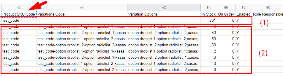
Product area should be defined as:

  • (1) first line - info of the product and its relations
  • (2) all lines under with the same SKU code before end of file or another SKU code (SKU code should be same and present in all lines of the product data)
Product Import Syntax

Add following fields for specific-serialized relations:

  • Parents [name of the parent module]. eg: `Catalog`
    • Value: [parent item urls separated by `;`].
      eg:
      `/catalog-1/sub-catalog;/catalog-1;/;`
  • Sale Price
    • Value: [country]-[currency]/[sale-price],[quantity for threshold option №1]/[price threshold option №1],[quantity for threshold option №2]/[price threshold option №2];
      eg: AU-AUD/30.00,2/26.00,5/22.00;AU-USD/20.00,10/18.00,100/16.00;

      NOTES:
      If no [currency] specified - use Currency-By-Country-Defaults.json mapper as default currency for country definition
  • Retail Price
    • Value: [country]-[currency]/[sale-price];
      eg:

    AU-AUD/30.00;AU-USD/20.00;

    NOTES:
    If no [currency] specified - use Currency-By-Country-Defaults.json mapper as default currency for country definition

  • Tax Code
    • Value: [country]/[tax_name or "Never"];
      eg:
      AU/Never;US/AZ;

      NOTES:
      If [tax_name] not set to the country or [tax_name] === ”Never”, do not apply tax
  • Grouping Product Codes
    • Value: [product_sku_code][Is_main_product];
      eg:
      sub_prod_1;main_prod*;sub_prod_2;

      NOTES:
      If [Is_main_product] == "*" then this product IS main. Otherwise this product IS NOT main.

      If several products shown to be main - use last one as main and ignore others.
  • Grouping Product Display Name
    • Value: [product_display_name];
      eg:
      Sub product 1;;Sub product 2;

      NOTES:
      Can be empty.
  • Related Products
    • Value: [product_sku_code];
      eg:
      HAYNM5AXVB;sub_prod_1;HMDP9271;
  • Low Stock Notification
    • Value: number
      eg:
      50

      NOTES:
      Greater than or equal to 0
  • Enable Inventory Control
    • Value: (boolean) true or false
      eg:
      Y or TRUE
      N or FALSE or empty
  • Can Pre-Order
    • Value: (boolean) true or false
      eg:
      Y or TRUE
      N or FALSE or empty
  • Hide if Out of Stock
    • Value: (boolean) true or false
      eg:
      Y or TRUE
      N or FALSE or empty
  • Attributes
    (ignore this cell value if product ALREADY EXIST AND has GENERATED VARIATIONS AND "Variations Enabled" cell != FALSE)
    • Value: (complex pattern described below, intended to be on one line)

      [attribute name][is_required]
      |
      [attribute_type]
      |
      [is_inventory_item]
      :
      [option_name]
      |
      [option_image_path]
      |
      [country]-[currency]
      /
      [option_price_1]
      |
      [country]-[currency]
      /
      [option_price_2]
      ,
      [option_name]
      |
      [option_image_path]
      |
      [country]-[currency]
      /
      [option_price_1]
      ,
      [option_name]
      ||
      [country]-[currency]
      /
      [option_price_1]
      ; (repeat)

      NOTES:
      I
      f no [currency] specified - use Currency-By-Country-Defaults.json mapper as default currency for country definition

      [option_name] CAN'T contain following symbols
      - |
      - ,
      - '
      - *

      If [is_required] == * then this product IS required. Otherwise it’s not.

      [attribute_type] is one of the following:
      - 5 or DropDownList
      - 6 or CheckBoxList
      - 7 or RadioList

      [is_inventory_item] - determines if current attribute is inventory attribute, one of:
      - Y or True - (boolean) true
      - N or False - (boolean) false

      [option_image_path] and option prices are not required and can be skipped in format string.

      Example string:
      Test attr checklist*|6|N:option checklist 1|/img.jpg|AU/10|US/5,option checklist 2|/img.jpg|AU/20|US/15,option ck 3|;Test attr Dropdown List*|5|Y:option droplist 1|/img.jpg|AU/10|US/5,option droplist 2|/img.jpg|AU/20|US/15;Test attr radiolist*|7|Y:option radiolist 1|/img.jpg|AU/10|US/5,option radiolist 2|/img.jpg|AU/20|US/15;ddfdsd*|5|Y:aasas||AU/20|US/15,xasas||AU/20|US/15

  • Wholesale Sale Price
    • Value: (pattern described below, intended to be on one line)

      [country]-[currency]
      /
      [sale-price]
      ,
      [quantity for threshold option №1]
      /
      [price threshold option №1]
      ,
      [quantity for threshold option №2]
      /
      [price threshold option №2]
      ; (repeat)

      NOTES:
      If no [currency] specified - use Currency-By-Country-Defaults.json mapper as default currency for country definition

      Example String:
      AU-AUD/30.00,2/26.00,5/22.00;AU-USD/20.00,10/18.00,100/16.00;
  • Recurring Type
    • Value: one of (numeric or string value)
      - 1 or Once
      - 2 or Daily
      - 3 or Weekly
      - 4 or Fortnightly
      - 5 or Monthly
      - 6 or Quarterly
      - 7 or Half Yearly
      - 8 or Yearly
  • Hide if Out of Stock
    • Value: (boolean) true or false
      eg:
      Y or TRUE
      N or FALSE or empty

      NOTES:
      If TRUE and no variations was created earlier - generate all variations and edit them by the values within columns
      Variations Code, Enabled, In Stock, Pre-Order determining variation by attribute options combination in the column Variation Options.
      If FALSE - discard variations.
  • Variation SKU Code
    This column and columns below are assigned both to initial (global) product and to it’s variations.
    - Value for the first row assigned to the global product settings.
    - Values in the row/s below (that relate to initial product) are assigned to each variation row.
    • Value: string (unique SKU code, should be empty for product row but required for variation row)
      If not set - ignore entire variation row data.

      Eg:
      HAYNM5AXVB
  • Enabled
    • Value: (boolean) true or false
      eg:
      Y or TRUE
      N or FALSE or empty
  • Variation Options
    • Value:
      [option_of_attribute_1]
      ;
      [option_of_attribute_2]
      ; etc.

      NOTES:
      Determines what variation should be edited by the fields:
      - Variations Code
      - Enabled
      - In Stock
      - Pre-Order

      If such combination not found in the product - ignore changes in this row for the following columns:
      - Variations Code
      - Enabled
      - In Stock
      - Pre-Order

      eg:
      HAYNM5AXVB;sub_prod_1;HMDP9271;
  • In Stock
    • Value: number (greater than or equal to 0)
  • Pre-Order
    • Value: number (greater than or equal to 0)

Deleting

Found under the main auxiliary menu (), you can delete ALL Products in bulk using the "Delete All Items" option.

Additionally, you can make bulk selections from the item list view (by ticking the checkboxes on the left of each item) and click the "DELETE SELECTION" button that will appear at the base of the list view.

Individual items can be deleted either by expanding the auxiliary menu to the right of each item and selecting the "Delete" option or when on the item's edit page, click the trash can icon () in the lower right of the page.

Bulk Apply Template

After making a selection of module items, using the checkboxes to the left of each item, an “Apply Template” option will become available in the main auxiliary menu () allowing you to assign a template, in bulk, to the selected items.

Populating Product Items

From the Products item list view, click the “CREATE NEW” button at the top to start creating a new item or click directly on the name of any existing item in the list.

Upon editing an item you have access to the following options.

Settings

Item Settings

This group of options mostly correspond with how your Module was configured (see above configuration steps) along with some item specific options.
If your screen doesn’t show some of the options here it’s likely due to how the Module is configured, or due to a site plan functionality restriction.

You can quickly collapse this section, by clicking on its header, to condense your workspace and help with moving to the next set of options.

Below is a detailed explanation of all possible options found here:

Option
Description
Item Name
Set the item's Name
This is used to describe the item within the admin area and also typically used as the display name of the item when rendered to your website front-end.
URL

The system will generate a unique base URL derived from the name you set. You can however, adjust this path (slug) if desired simply by setting a new value in this field.
URL slugs are limited to 254 characters in length.

<Source Module>

If the item belongs to a nested module structure you'll see the name of the parent module here with the ability to select which of those parent module items this new item will belong too.

Nested Modules are only available in Pro plan or higher.

Template
A list of available Content Templates. The selected Content Template will be applied to newly created Module item when viewed at its unique URL.
Detail Layout

The Detail Layout to use for the item when viewed at its unique URL.

Multiple Detail Layouts are only available in Pro plan or higher.

Enabled

Uncheck this option to disable the item from being published to the website front-end. The item will remain available in the admin but will not be made live.

Set as Home Page

If checked, the item will be displayed at the websites root domain (ie: https://www.mydomain.com/) and be flagged as the sites Home page.

Only one item in the site can be assigned as the Home Page. Setting this option for an item will remove any previously assigned home Page setting from another item.

Disable From Site Search

If checked, the item will not be retrieved in any front-end site searches.

Release Date

Set a date and time in which the item will be published and available for access on the website front-end.

Expiration Date

Set a date and time in which the item will be unpublished and no longer available for access on the website front-end.

Weighting

Set a numerical value in which the item will be sorted by in default list views on the website front-end.
By default, higher values see the item listed above lower value items.
When a weighting value is applied to an item it overrides the default alpha-numeric sorting of lists (based on the item Name).

Make Item Secure

A list of available Secure Zones the item can be assigned to. Multiple Secure Zones can be selected.
Assigning a Secure Zone will set its unique URL to authorised access only. Only if the viewer is logged in and is subscribed to the relevant Secure Zone/s can the item be accessed.

Secured items, by default, will still be listed in any relevant searches, list views and liquid collections on the website front-end even when the viewer is not logged in to any secure zones.

With all child items

Secure Zone inheritance for nested child items.
If your module is configured in a nested configuration, where this item belongs to the parent module, all of its child items will inherit this Secure Zone setting.

Site Search Keywords

Should contain Comma Separated Values (CSV) for keywords.
Provides additional keywords to influence Site Search results, along with the item name and description.

System Properties

This group of options correspond with the built-in System Properties specific to this particular module providing special system functionality.
If the ‘System Properties’ section is missing altogether it’s likely due to no system properties being applicable for this module.

You can quickly collapse this section, by clicking on its header, to condense your workspace and help with moving to the next set of options.

Below is a detailed explanation of all possible options found here:

Option
Description
Small Image

A primary image for the Product, intended to be displayed in Product list style layouts.
An optional ‘Downloadable file’ checkbox is assigned to this field which will append the ?downloadable=1 parameter to the file path, allowing the file to be a direct download.

Large Image

A primary image for the Product, intended to be displayed in Product detail layouts.
An optional ‘Downloadable file’ checkbox is assigned to this field which will append the ?downloadable=1 parameter to the file path, allowing the file to be a direct download.

On Sale

Sets the OnSale property of the Product to ‘true’ which can then be used in your Liquid markup to conditionally style the item or otherwise construct you Product markup.

Is Gift Voucher

Sets this Product as a digital Gift Voucher and turns on the Gift Voucher workflow for when this item is purchased.
See Gift vouchers for more information.

Product Weight

Assigns a weight value for this item’s packaging dimensions intended for integrated shipping calculations.

Product Width

Assigns a width value for this item’s packaging dimensions intended for integrated shipping calculations.

Product Height

Assigns a height value for this item’s packaging dimensions intended for integrated shipping calculations.

Product Depth

Assigns a depth value for this item’s packaging dimensions intended for integrated shipping calculations.

Enable Drop Shipping

Sets this Product as having a third party supplier and turns on the Drop Shipping workflow for when this item is purchased.
Use in conjunction with the below ‘Supplier’ field.

Supplier

A third party email address of the supplier of this Product.
When this Product is purchased an email notification regarding the order details will be sent to this email address intended for notification to fulfil this item of the purchase.

The email address selected here must be an existing record in the CRM.

Unit Type

A value to describe the purchasable units of the Product. Eg: p/kg, m2, each, pack, box, carton, etc.

Minimum Units

The minimum quantity level allowed to be added to the cart. Treepl CMS will add validation for minimum units when adding a product to the cart and when a unit quantity is changed in the cart.

Maximum Units

The maximum quantity level allowed to be added to the cart. Treepl CMS will add validation for maximum units when adding a product to the cart and when a unit quantity is changed in the cart.

Recurring Type

Sets a recurrence period for this Product and turns on the recurring workflow for when this item is purchased.

Enable Shipping

When unchecked, shipping options will not be applied to this Product. If all items in the shopping cart have shipping disable then no shipping options will be present.

Is Downloadable Product

Sets this Product as a digital/downloadable item and turns on the Downloadable Product workflow for when this item is purchased.
This includes the file download link added to the invoice email.
Used in conjunction with the ‘Product File’ field.

Product File

Allows the upload and management of the ‘Downloadable Product’ file to a secure location only accessible via a system link and under the allowed conditions (ie: payment made, still within max downloads limit, etc.).

Max Downloads Allowed

Restricts the number of times this file can be downloaded per order (via a unique system link generated for each order).

Added By

You can assign a relationship for the item to any contact record that exists in the CRM (new email addresses will not be saved).
If the item was created by a user submitting it from the website front-end, that users email address will be assigned here.

This property will only be available if the module is configured to allow adding/editing/deleting of items via the 'Site User Permissions' settings.

Custom Properties

This group of options correspond with the Custom Properties configured for your Module (see above configuration steps).
If the ‘Custom Properties’ section is missing altogether it’s likely due to no custom properties being added.

You can quickly collapse this section, by clicking on its header, to condense your workspace and help with moving to the next set of options.

Default Properties

This group of options correspond with how your Module was configured (see above configuration steps).
If your screen doesn’t show some of the options here it’s likely due to how the Module is configured, or due to a site plan functionality restriction.
If the ‘Default Properties’ section is missing altogether it’s likely none of these system properties have been enabled.

You can quickly collapse this section, by clicking on its header, to condense your workspace and help with moving to the next set of options.

Below is a detailed explanation of all possible options found here:

Option
Description
Categories

Assign global Categories for various display/filtering/sorting options on the website front-end.
Use the “+ Add New Category” button to create new Categories and/or manage existing ones.

Global Categories can also be managed under 'Settings' > 'Categories' in the main admin menu.

Tags

Assign Tags (unique to the current module) for various display/filtering/sorting options on the website front-end.
Use the “+ Add New Tag” button to create new Tags and/or manage existing ones.

Author

Assign a system Author for various display/filtering/sorting options on the website front-end.

Authors can be managed under 'Content' > 'Authors' in the main admin menu.

Content

The content section is typically used for adding/editing the main body of content for the item, or otherwise described as the main description of the item.

This editor can be toggled between WYSIWYG (design/layout) view and Code View to provide full freedom and flexibility for the content that you can add here, including HTML, CSS, JS, images, video, embed codes, text styling and more.
The editor also supports Liquid and component tags can be added using the ‘Component’ manager at the top right of the editor.

Prices

Price points can be set at multiple currencies for both Consumer and Wholesaler levels along with tax assignment and unlimited volume discount levels.

The ‘+ Add New Price’ button allows you to add additional price points for each currency your site supports. Saved prices will display in a list ready for further editing as needed.

Below are descriptions of the pricing options.

Option
Description
Currency/Country
The Currency/Country combinations available for your site. Based on the domains added to the site and their assigned currency format and country settings. (see Domains for more details on configuring site domains and settings)
Consumer Tab
Prices configured under this tab will apply to all regular site users who are not logged in and not assigned to the ‘Wholesaler’ type in their CRM record.
Wholesaler Tab
Prices configured under this tab will apply to all logged in users who are assigned to the ‘Wholesaler’ type in their CRM record.
RRP
This is a display only price intended for use as a Recommended Retail Price label which can be displayed in your item layouts.

This price is not used by the eCommerce system for any calculations or transactions.

Sell Price
The assigned base price of the item which will be used for price calculations and transactions when ordering.
Enable Volume Discount

When checked, you’ll have the ability to create multiple discount threshold rules (by clicking the ‘+Add New Discount’ link) to be applied based on the item unit quantity being purchased.

Quantity Threshold determines the minimum units needed to be ordered for the new discounted price to apply.

Sell Price sets the new per unit price of the item to be applied whilestever the minimum quantity threshold level is met (or another volume discount rule overrides it).

Tax Never Applies
When checked, tax calculations will not be applied to this item.
Tax Code
The Tax codes available for your site. Based on the taxes added under ‘eCommerce’>‘Taxes’. (see Taxes for more details on configuring taxes)

Catalog

This tab will only be visible when the module is in a nested configuration, with a parent and child module grouping, and when the child module allows ‘multiple parent items’ in its advanced settings.

The tab will carry the name of the parent/child module, depending on which module you are viewing.

See module Advanced Setting above for more details on this configuration.

This page will display the items from the Catalog module and allows you to assign multiple Catalog to the current Product item - by dragging and dropping from the available items on the left into the assigned list on the right. Or you can remove Catalog from the Product by moving them from right to left.

Additionally, the directional arrows in the middle can be used to move selected items right or left, or to move ALL items together right or left (using the double arrow buttons). This can be useful to clear all assigned Catalog from the Product quickly, for example.

Attributes

Attributes allow you to add any number of options to your product that can then be configured for the product for purchasing.

Attributes can be optional or required, include a price point of their own and even include an additional image reference.

Clicking the ‘ADD NEW ATTRIBUTE’ button will start a new attribute group which will hold that attributes options.

The settings available are as follows:

Option
Description
Attribute Name
The title for the attribute group
Attribute Type

The input type used to display the attributes options. Available types are:

Checkbox list renders a group of checkbox inputs, allowing multiple options to be selected/deselected.

Dropdown list renders a select input, allowing a single option to be selected or reset.

Radio list renders a group of radio inputs, allowing a single option to be selected but not reset.

Value Type
Fixed price (currently the only option) allows attribute options to have a set price that increases the main product price when selected.
Required
Turns on validation for the attribute group, enforcing the user to select one of its options before adding to the cart.
Add to Inventory

Allows the attribute groups options to be added to the inventory control when inventory ‘variations’ are generated. Attribute groups without this option selected will not create their own order variations or be counted as a separate stock item.

If inventory variations are already enabled for the product, this option will not be available. All current inventory variations must first be discarded and re-generated after any new attribute groups have been added (the total inventory levels will be restored to the overall product inventory).
Additional attribute options within the group can be added without the need to discard currently generated variations, however, those newly added options will be disabled in the inventory control system by default. You can then edit the inventory to enable these additions and set their stock levels as required.

See the below Inventory section for more details regarding inventory control and product variations.

To later edit an Attribute group’s settings, click the ‘ Edit Attribute’ link.

To add options to an Attribute group, click the ‘ Add new option’ link, which will open the options panel providing the following settings:

Option
Description
Option
The name of the option presented within the Attribute group input.
Image
Allows the addition of an image to depict the option. Use the ‘add file’ icon () to browse for or upload an image file.

By default, images will display alongside checkbox and radio inputs but cannot be displayed for dropdown inputs due to the nature of that input element. You can, of course, customise these layout components to adapt your own design solutions.

Currency &Price
Allows a price point to be assigned to the option per currency configured for your site. (see Domains for more details on configuring site domains and settings)

Individual attribute options can be later edited or deleted via the pencil () and trash can () icons alongside each individual option.

Both Attribute groups and their options will render on the front-end of your site in the order they appear in the admin.
This ordering can easily be adjusted by grabbing the placement icon () and dragging and dropping the item rows into their desired locations.

To display the Product attributes on your site, you can add the ‘Product attributes’ tag to your Product layouts via the Component Manager under the ‘eCommerce’ section. See also further configuration options for this tag here.

Inventory

Tracking inventory can be managed on a per product level and can be used for controlling how products display and if they can be pre-ordered on the front-end website.

Inventory control also provides functionality for low stock notifications, pre-order quantities and current in-cart quantities.

If products have certain attributes that affect different stock levels that need to be tracked, you can also enable inventory management down to each attribute option, selectively.
For example, if selling a Chair with attributes of colour and assembly, it may be required to track inventory for the colour variations of that single product, but not relevant for the assembly option selected.

A detailed look at the Inventory options are as follows.

Option
Description
Inventory Control Enabled
When checked allows for the management of inventory features (as below).
GENERATE VARIATION
Creates inventory items from any Attributes marked with ‘Add to Inventory’ (more on this below).
When Out of Stock

Determine how Products are to be handled on the front-end website when their stock levels fall below 0.

Hide product disables the product from displaying at all on the front-end when stock falls below 0.

Enable pre-ordering continues displaying the product on the front-end when stock falls below 0 and allows it to be purchased with pre-order status.

Show product but don't accept orders continues displaying the product on the front-end when stock falls below 0 but does not allow it to be added to the cart for purchasing.

You may want to use Liquid to conditionally display a note against such products, or even disable the ‘Add to Cart’ buttons.

Low Stock Notification
Triggers the system Low Stock Workflow Notification when stock falls on or below this value.
If using Inventory Attribute Variations, the notification will be triggered per variation reaching the set threshold value.

See ‘Email Notifications’ in the main admin menu to configure both ‘Workflows’ and ‘System Emails’ regarding the Low Stock notifications layouts and recipients.

In Stock
The quantity level currently in stock available for ordering.
Pre-order
The quantity level of pre-ordered stock (Products ordered whilst out of stock).
Added to Shopping Cart
The quantity level of Products currently added to all active shopping cart sessions.

You can adjust the lifespan of cart sessions under ‘eCommerce’ > ‘Settings’ > 'Shop Settings' in the main admin menu.

Generate Variations

When you enable variations, any attribute groups that have been set as ‘Add to inventory’ will be created here as individual stock lines.

The original stock levels, for the overall product, will be reassigned to the next available stock line where you can then reallocate the levels as needed.

Each attribute option will now have its own ‘In Stock’, ‘Pre-order’, and ‘Added to Shopping Cart’ levels, as per the above table, for fine grain inventory tracking.
Optionally, you can disable an individual attribute option to exclude it from inventory management.

When inventory variations are enabled and you need to add additional attribute groups to the Product, that also require inventory tracking, you will first need to discard the inventory variations and then re-generated after any new attribute groups have been added (the total inventory levels will be restored to the overall product inventory when discarding). Additional attribute options within the group can be added, but will be disabled in the inventory variations by default. You can then edit the inventory to enable these additions and set their stock levels as required.
See the Attributes section above for more details

If using Low Stock Notification, the notification will be triggered per variation reaching the set threshold value.

Related Items

You can create a relationship between two or more items within the Product module which is useful for displaying similar, or potential up-sell, Products alongside the current Product on the front-end website.

This page will display all other Product items and allows you to assign those items to the current Product item - by dragging and dropping available items from the left into the assigned list on the right. Or you can remove relationships by moving them from the right to the left.

Additionally, the directional arrows in the middle can be used to move selected items right or left, or to move ALL items together right or left (using the double arrow buttons). This can be useful to clear all assigned relationships from the Product quickly, for example.

To display the related products on your site, you can add the 'Related Products' tag to your Product layouts via the Component Manager under the ‘eCommerce’ section. See also further configuration options for this tag here.

Group Items

Grouping Products together provides another way to create item relationships and the grouped products can then be displayed in the Product layout and used to easily switch between them.

Grouping Products is useful when you have multiple very similar Products but they differ slightly in ways that can’t be expressed via Product attributes or other options.

To display the grouped products on your site, you can add the 'Grouped Products' tag to your Product layouts via the Component Manager under the ‘eCommerce’ section. See also further configuration options for the Grouped Products tag here.

An example of this component tag is:

{% component type: "grouped_items", source: "Products", itemId: "<Item ID>" %}

How it Works

When a grouped product is selected, either from your list view or detail view of your website, Treepl CMS will use AJAX to fetch that layout region of the selected product and replace it on the page in place of the current product.

To do this, the system needs to identify the region to fetch and to replace and so whenever there is a grouped product detected for a rendered product, list or detail view, a HTML element will be added which wraps the layout with an identifying attribute.

This element is formatted as such:

<div class="cms-product-wrapper" data-cms_product_wrapper="2443" data-cms_layout_name="{model.Layout}"></div>

If you’re rendering products outside of the typical layouts method (ie: via a custom Liquid collection and forloop), you will need to add this wrapper to your code manually.

Javascript Considerations

Since the grouped product layout is being added to the page via AJAX you may encounter issues with any javascript related functionality within that products layout view (such as an image slider/zoom or other interactive effects driven by javascript), as the newly added scripts will not fire since the page has not been reloaded.

To resolve these types of issues, you may need to reinitiate your javascript functions after the grouped product has been fetched.

To make this easier for you, Treepl CMS will fire a javascript event once the AJAX call has completed. The event is named onProductLayoutChanged and an example of its use might be as follows (using jQuery and added to your sites JS file):

$('body').on('onProductLayoutChanged', function(){
    // Do something here like re-initiate your product related Javascript plugins/scripts
});

SEO

SEO Content
Option
Description
Preview

A preview of how the below metadata might display in search engine listings.

This is a simulated preview only. Actual search engine listings may vary.

Meta Title

The descriptive title of the document. Typically displayed in the browser's title bar or tab.
This value, if set, will be automatically output as <title><Meta Title></title> and added to the <head> of the item's page.
If left empty, the item's Name will be used instead.

If your Content Template already contains a hard-coded <title> element it will not be replaced by the system.

Meta Description

A short description of the document.
This value, if set, will be automatically output as <meta name"description” content"Meta Description"/> and added to the <head> of the item's page.
If left empty, no <meta name"description"> element will be added.

If your Content Template already contains a hard-coded <meta name"description"> element the system will add an additional <meta name"description"> element if this value is set.

Additional <head> Code

Item specific <head> elements can be added here for the system to include in the item's <head> section.
Can be used for adding additional metadata, styles, scripts, etc.

Liquid is not currently supported in this field.

Show this page for
search engines

If unchecked, the system will add <meta name"robots” content"noindex, nofollow"> to the item's <head> section.
This helps inform search engines to not display this item's page in search engine results or follow any of the page's links for indexing purposes.

If your Content Template already contains a hard-coded <meta name"robots"> element the system will add an additional <meta name"robots"> element if this option is unchecked.

Canonical Link

The preferred content URL when other similar content pages may exist. This value should be an absolute URL.
The site's primary domain will be displayed as the first option here.
Setting a canonical link helps inform search engines of the primary content source when duplicate or similar content pages exist so as to help avoid SEO penalties and other linking confusion.
This value, if set, will be automatically output as <link rel"canonical” href"Canonical Link"> and added to the <head> of the item's page.
If left empty, no <link rel"canonical"> element will be added.

If your Content Template already contains a hard-coded <link rel"canonical"> element the system will add an additional <link rel"canonical"> element if this value is set.

SEO Priority

The priority value in your system generated sitemap.xml file.
This value, if set, will replace the default priority value of 0.5 in the <priority> element for this item's sitemap entry.

Open Graph
Option
Description
Open Graph

The values provided here help other platforms, such as social media services (particularly Facebook) to better define this item's content.
These values, if set, will be automatically generated into the Open Graph metadata schema into the <head> of the item's page.
eg: <meta property"og:PROP_TYPE" content"PROP_VALUE"/>

If your Content Template already contains any hard-coded <meta property"og:PROP_TYPE"> elements, the system will add an additional <meta property"og:PROP_TYPE"> elements if these values are set.

AMP Content
Option
Description
Enable AMP

Activate AMP content.

Content

Your AMP coded content.

Displaying Product Items

You can render Product items to your website front-end in a variety of ways and places such as; pages, layouts, templates, emails and just about anywhere else that supports Liquid.

Most commonly though, your Products would be displayed within your eCommerce Catalogs and therefore you’d look to your Catalog layouts to configure your Product component tag.

You could, of course, render a list of Products, or even just a specific Product, to a standard web page or other module layout. To do this, insert the Liquid component tag for Products to your page or layout and configure the tag to output the required Product data.

You can use the Component Manager to configure your Product component tag and insert it into the editor, or you can manually configure them by coding the desired parameters directly into the tag.

Both options are described in further detail below.

If you want to use ‘Add to Cart’ buttons, Quantity field, Attributes, etc. in your Product list view, you will need to add the {{this.ProductDataJsonHTML}} Liquid object to the Product list layout (which feeds all the relevant Product data to the javascript functions allowing them to work correctly).
Be sure to add this tag to the very bottom of your layout code (below any buttons/items that require it).
This Liquid object will be added automatically in the detail layouts.

Using the Component Manager

Found at the top right of the content editor section, clicking the ‘ Components’ button will reveal a list of available modules and other system items.

Accessing Component Manager

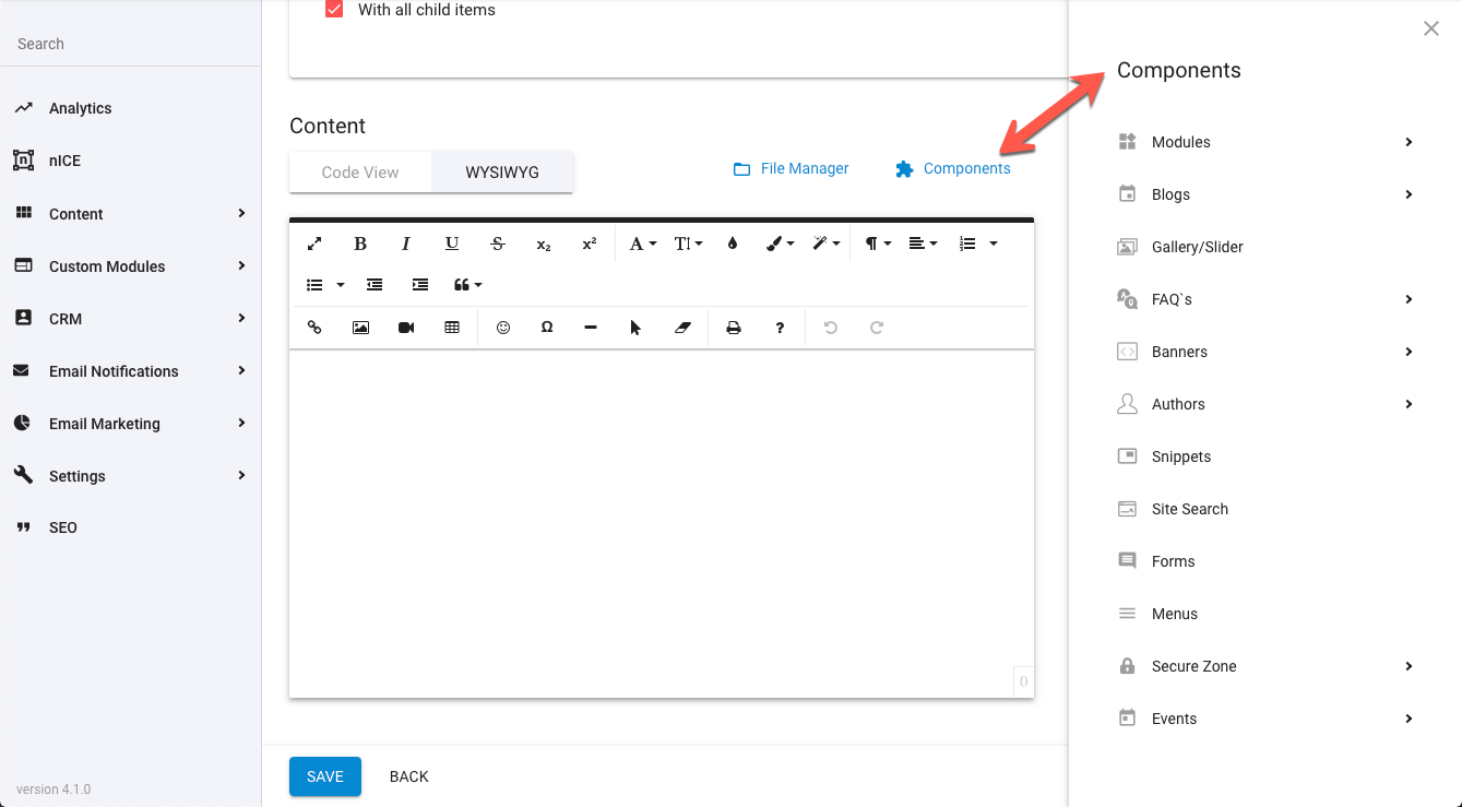
Expanding the 'eCommerce' section, select 'Products list' option to open the component configuration panel.

These can also be found in the Components Manager under the 'eCommerce' section and include functions like Add to Cart/Buy Now buttons, Product Attribute options, Quantity input field, Grouped and Related Products, etc.

For further details on these components and their configuration options, see the Related Articles section below.

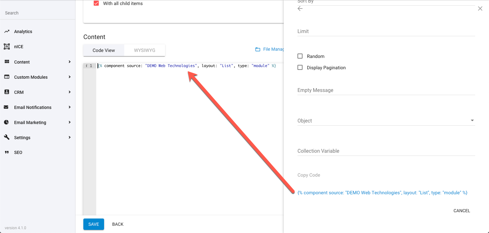
Follow the prompts to configure the way you'd like to retrieve Products (such as; how to filter and sort items, how many to render, use of pagination, etc.) then click the blue link/s at the end to copy the constructed component code to your clipboard. Now you can paste this code into your page content or where otherwise required.
To learn more about these render options, view the 'Component Tag Advanced Customisation' documentation link/s below.

Component Manager Copying Code

Component Tag Advanced Customisation

See here for more detailed documentation on manually configuring the Products component tag.

Searching Product Items

Searching within Products can be achieved with a search form and the module’s component tag configured with the isSearchResult parameter.

Simple keyword based searches can be set up as well as more advanced search forms with specific system and custom fields searchable along with range searches for date and price/number fields.

You can configure a Product search with two parts; the search form and the module’s component tag. More on these parts below:

Component Tag with ‘isSearchResult’

To render the search results to the page and/or a collection, you need to configure the module’s component tag with the isSearchResult parameter set to true (see the Product component documentation for technical details).

{% component type: "module", source: "Products", layout: "List", isSearchResult: "true" %}

This will allow the component to reference search parameters in the resulting URL.

URL search parameters will override any corresponding parameters in the component. If no search parameters are present in the URL, isSearchResult will be ignored.

You may want to separate the search form from the component tag if you want a dedicated search results page, or where you have a search input in the header or footer of all pages as so searches could be made from any page.

This method also alleviates a side-effect of the isSearchResult configured component whereby it will output all indexed items by default if no search query has been specified (ie: when a user first navigates to a search page).

If you do want one single search page, with both search form and component and don’t want to initially list all results, another solution to this is to wrap the component tag in a Liquid condition which looks for the presence of the prop_KeyWords parameter in the URL, like so:

{% if request.request_url.params.prop_KeyWords %}
    {% component type: "module", source: "Products", layout: "List", isSearchResult: "true" %}
{% endif %}

Basic Search Form

A basic keyword based search form for Products would be constructed like the following:

<form>
    <input type="hidden" name="prop_ModuleId" value="1234">
    <label>Keywords</label>
    <input type="text" name="prop_KeyWords" maxlength="255" value="{{request.request_url.params.prop_KeyWords}}">
    <input type="submit" value="Search">
</form>

This form element includes a prop_KeyWords text input, prop_ModuleId hidden input, a submit button and no form action attribute.

The prop_ModuleId hidden input tells the search which module to search (replace ‘1234’ with the ID of your module).

The prop_KeyWords text input allows multiple keywords to be entered for searching.

The search logic combines multiple keywords with an AND operator, so items will be returned only if they include ALL keywords entered.

Currently, searching does not support any manual logic operators to be used in the keyword input field (such as; AND, OR, NOT...)

When the form is submitted, prop_ModuleId and prop_KeyWords, along with their values, will be passed as URL parameters for the isSearchResult configured component tag to interpret.

By default, the search form has no action attribute, so it will redirect to the current page with the URL parameter appended to the current page URL.

You can, instead, separate the search form from the ‘site_search’ component, having the module component on a separate page and sending the search query to that page instead of the current page.

To do this, you’d add the other page URL slug to the form element. So if the other page was “/search-results”, you’d adjust the form to include an action attribute as such:

<form action="/search-results">

Advanced Search Form

Building further on the basic form structure above, you can add Product specific fields to search their contents, either individually or combined with other fields and/or keyword queries.

The search logic combines all field queries with an AND operator, so items will be returned only if they include ALL the queries entered.

The fields (providing they are available to the module) that can be search upon include:

  • Name
  • URL (Slug)
  • SKU Code
  • Release Date
  • Expiry Date
  • Site Search Keywords
  • Rating
  • Description
  • Any ‘Default Properties’ (eg: Categories, Tags, Author...)
  • Any ‘Custom Properties’
  • Module specific ‘System Properties’ (Price, Product Dimensions, Unit Type, Capacity...)

To add these fields to your search form, create an appropriate input with the name attribute configured like prop_PropertyName.

So, if you were adding a search field for a custom property called “Vehicle Colour”, the form input might look like this:

<input type="text" name="prop_VehicleColour">

Follow this same format for most other properties. Although you may like to change the input type to suit the type of data required.

For example, if our above “Vehicle Colour” property was actually a dropdown field with predefined colour values, you may choose to create a <select> element instead, like so:

<select name="prop_VehicleColour">
    <option value="Red">Red</option>
    <option value="Blue">Blue</option>
    <option value="Green">Green</option>
</select>

After the search form has been submitted, you might also like to keep the search queries filled in the search form fields, for better usability. So to do this you can pull the query parameters out of the URL and into the input values, like so:

<input type="text" name="prop_VehicleColour" value="{{request.request_url.params.prop_VehicleColour}}">

Search Within Number Ranges

For property types such as dates, prices, ratings and numbers, you can search with a to-from/min-max range by adding _Min or _Max to the property name.

So let’s say you want to search for items within a certain date range, based on their release/expiry dates.

<input type="datetime-local" name="prop_ReleaseDate_Min">
<input type="datetime-local" name="prop_ExpiryDate_Max">

And to populate these fields with the searched values:

<input type="datetime-local" name="prop_ReleaseDate_Min" value="{{request.request_url.params.prop_ReleaseDate_Min | date: "%Y-%m-%dT%H:%M"}}">
<input type="datetime-local" name="prop_ExpiryDate_Max" value="{{request.request_url.params.prop_ExpiryDate_Max | date: "%Y-%m-%dT%H:%M"}}">

Searching for a minimum release date will return all items with a release date newer (or the same as) the query date. And likewise searching for a maximum expiry date will return all items with an expiry date older (or the same as) the query date.

Programmatically Search (without a form)

There may be times when you require the search results for a module based on constructed data, other than that of a user’s input into a search form.

You can achieve this with the use of the searchScope parameter on the module’s component tag (see the Product component documentation for technical details).

This parameter allows a search on the module without search parameters needed in the URL. Instead, search parameters are added to the value of this parameter. Therefore, this parameter can be used to output module specific search results from hard-coded (or Liquid constructed) values without the use of a search form.

The search queries are similar to that used in the above form based search method, but use JSON syntax for their construction.

Below is an example of a constructed searchScope configured component tag, with min/max release date search, keywords and multiple tags query:

{% component type: "module", source: "Products", layout: "List", searchScope: "{'prop_ReleaseDate_Min':'2018-07-01', 'prop_ReleaseDate_Max':'2018-07-31', 'prop_KeyWords':'Your Keywords', 'prop_ItemTags':['tag1','tag2']}" %}

The search logic combines all field queries with an AND operator, so items will be returned only if they include ALL the queries entered.


Related Articles

  • Site Settings & Management
    Domains

    The Treepl CMS Domain settings allow you to control default domain, landing pages, domain authentication for system emails along with country and cultural settings like number and currency formatting.
  • Site Settings & Management
    Payment Settings

    Integrate various payment gateways, for multiple countries and currencies, into Treepl CMS for form payments, subscriptions and eCommerce workflows.
  • CRM
    Orders

    Orders store accounts of any payments made via the website and provide management for additional payments, invoices, order statuses, tracking info, the products purchased within the order and the details of the form submission used to take the order.
  • CRM
    Advanced CRM Groups

    Advanced CRM Groups allow you to extend the data fields within multiple areas of the CRM, either globally or on a per-record basis.
  • Liquid Objects & Usage
    {{ order }} object

    This liquid object will output the order details of a submitted payment. ...
  • Liquid Components
    module (Catalogs)

    This module component fetches data relating to eCommerce Catalogs and can be used to render Catalog structures and Products within them.
  • Liquid Components
    module (Products)

    This module component fetches data relating to eCommerce Products and can be used to render Product information.
  • Liquid Components
    ecommerce_add_to_cart

    This component renders an anchor element allowing the javascript function to add the item to the shopping cart.
  • Liquid Components
    ecommerce_buy_now

    This component renders an anchor element allowing the javascript function to add the item to the shopping cart and then proceeding directly to the shopping cart page.
  • Liquid Components
    ecommerce_item_quantity

    This component renders a form input element allowing a quantity to be set for when the source item is added to the shopping cart.
  • Liquid Components
    item_attributes

    This component fetches all attributes/options for a specified product. By default, each attribute group is rendered, with its options and any prices, according to their specified form inputs.
  • Liquid Components
    related_items

    This component fetches related items of a specific source item, such as a Product that has had Related Products assign to it.
  • Liquid Components
    grouped_items

    This component fetches grouped items of a specific source item, such as a Product that has been Grouped with other Products and allows the ability to navigate between grouped items.
  • Liquid Components
    currencies

    This component renders a form select element of all currency names, codes and symbols by default, and can also be used to output currency data to a Liquid collection.
  • Liquid Components
    shopping_cart

    This component fetches data relating to the shopping cart, such as any products added, order totals, tax, shipping, etc.
  • Liquid Components
    shipping_options

    This component renders a form select element of all shipping options configured on the site, and can also be used to output shipping option data to a Liquid collection.
  • Liquid Components
    shippingProviderFields

    This component provides a placeholder for populating additional Shipping Provider options to the user.
  • Liquid Components
    tax_codes

    This component renders a form select element of all tax codes configured on the site, and can also be used to output tax code data to a Liquid collection.
  • Liquid Components
    payment_form_fields

    This component is used to render payment fields, and payment related validation errors, within a form using the capabilities provided by your configured payment gateway.
  • Liquid Components
    orders

    This component fetches Orders from the CRM, either owned by the logged-in user or for all customer Orders.
  • eCommerce
    Getting Started

    To get started with the eCommerce module there are some overall settings to configure that provide eCommerce with further context in order to function appropriately for your situation.
  • eCommerce
    Catalogs

    When organising any eCommerce store, Catalogs are crucial to your Products structure and browserbility. Easily create and customise unlimited product catalogs for your online store.
  • eCommerce
    Discount codes

    Provide discount code functionality for your Treepl CMS shopping cart. Ideal for promotions, customer loyalty and conversions or to help move more stock.
  • eCommerce
    Gift vouchers

    Gift vouchers can be issued to your customers or purchased by them online via the shopping cart.
  • eCommerce
    Taxes

    Create any number of required tax codes specific to the shipping country selected in your Treepl CMS shopping cart.
  • Liquid Components
    countries

    This component renders a form select element of all country names and country codes by default, and can also be used to output country codes/names to a Liquid collection.
  • Liquid Components
    domain_settings

    This module component retrieves settings associated with the current domain, or optionally from another specified domain configured in the site instance.
  • eCommerce
    Shipping Options

    Treepl CMS provides the ability to configure both custom shipping options and integrated shipping providers based on a variety of conditions during the shopping cart stage.
  • eCommerce
    Settings

    These various eCommerce settings allow you to further control and customise the way your website functions, both in the admin and on the front-end, in terms of eCommerce functionality.
  • eCommerce
    eCommerce Javascript

    This is the provided javascript options for further controlling/customising the ecommerce javascript provided by the CMS.
  • Extensions
    Abandoned Cart Recovery

    With Abandoned Cart Recovery functionality, you can automatically send email reminders to customers who add products to their cart (while logged in) and leave without completing the order.
  • Public API
    CRM Orders

    Return or update Order item/s via the public API endpoint.
  • Extras
    Migrating to Advanced Payment Flow

    This article describes differences and possible required actions for migrating to the Advanced Payment Gateway flow.

External Resources

There are currently no external resources available.

Please let us know if you have any other contributions or know of any helpful resources you'd like to see added here.


Questions?

We are always happy to help with any questions you may have.
Visit the Treepl Forum for community support and to search previously asked questions or send us a message at support@treepl.co and we will consult you as soon as possible.